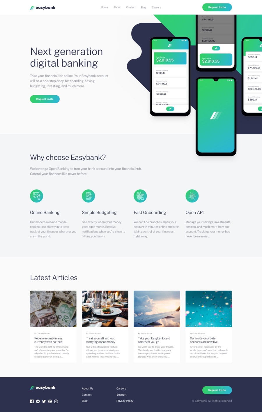
Design comparison
Solution retrospective
While I was working on this challenge, I've noticed a few things that could be improved. In the footer, I wanted the text of the logo to have the color, but it turned the design next to it also to white (I used filter because I didn't know how to change color of an image).
As for the media links below the logo, I tried filtering the color, so it has a background color of bright-cyan when hovered. However, I did not come close to bright-cyan.
Another thing, it may look weird when viewing the mobile version on a laptop because the image with the four phones will stick out of the container. However, it did not display the image stick out when I checked on my phone (not sure why).
Any feedbacks are appreciated!
Community feedback
Please log in to post a comment
Log in with GitHubJoin our Discord community
Join thousands of Frontend Mentor community members taking the challenges, sharing resources, helping each other, and chatting about all things front-end!
Join our Discord
