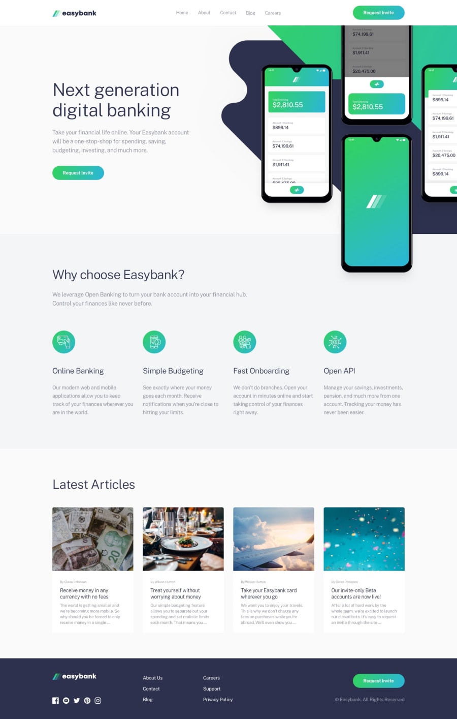
Design comparison
SolutionDesign
Solution retrospective
Had the most difficulty with determining how to setup the large graphics at the top. Had to consider that the smartphones mock graphic was overhanging a containing section but also that I had a max-width set even though the graphics extended out to the right beyond the max-width. Afterwards, had to deal with some oddities in Chrome and checking that Firefox and Chrome looked and acted similar. One additional thing I noticed is that resizing the window caused some rendering update issues.
Community feedback
Please log in to post a comment
Log in with GitHubJoin our Discord community
Join thousands of Frontend Mentor community members taking the challenges, sharing resources, helping each other, and chatting about all things front-end!
Join our Discord
