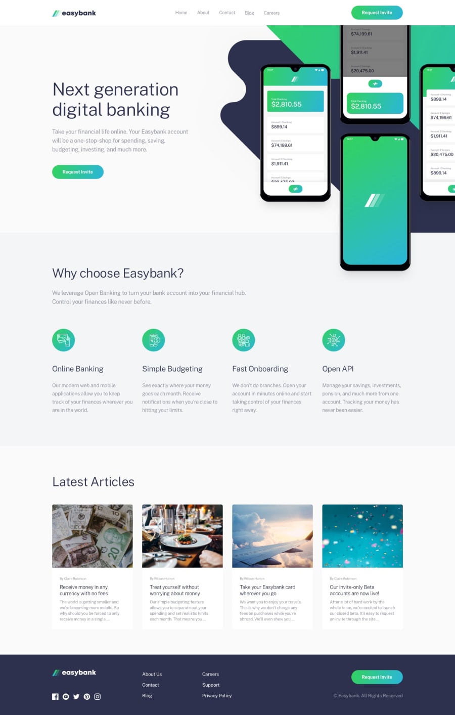
Design comparison
SolutionDesign
Solution retrospective
Hello, I'm looking for some feedback on this project. Specifically, when resizing the browser, in the why choose easybank section, when does the grid shift left and not align in the center of the page?
Also, why don't the hamburger lines rotate when clicked? I'm sure its a simple mistake in my JS but I'm just not seeing it.
Any other areas were you think I could improve would be helpful
Thanks
Join our Discord community
Join thousands of Frontend Mentor community members taking the challenges, sharing resources, helping each other, and chatting about all things front-end!
Join our Discord
