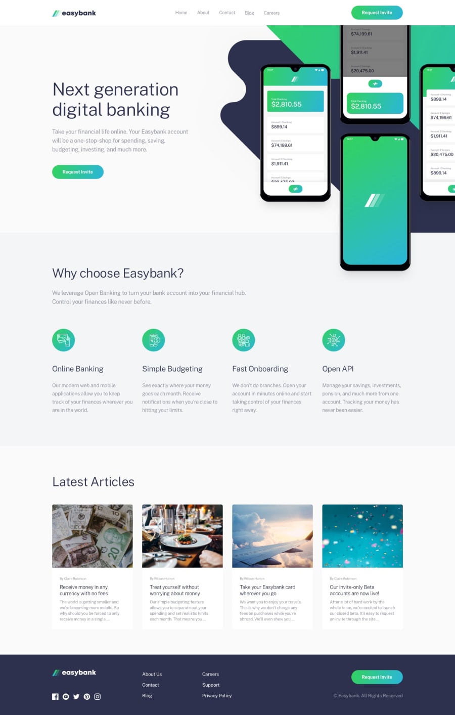
Design comparison
SolutionDesign
Solution retrospective
feedbacks are welcome :)
Community feedback
- @catherineisonlinePosted almost 2 years ago
Looks nice! I would also add cursor: pointer for the buttons and maybe some color transitions on hover, so looks more interactive.
Marked as helpful0@usmanahmedkhan09Posted almost 2 years ago@catherineisonline thanks for your feedback
0
Please log in to post a comment
Log in with GitHubJoin our Discord community
Join thousands of Frontend Mentor community members taking the challenges, sharing resources, helping each other, and chatting about all things front-end!
Join our Discord
