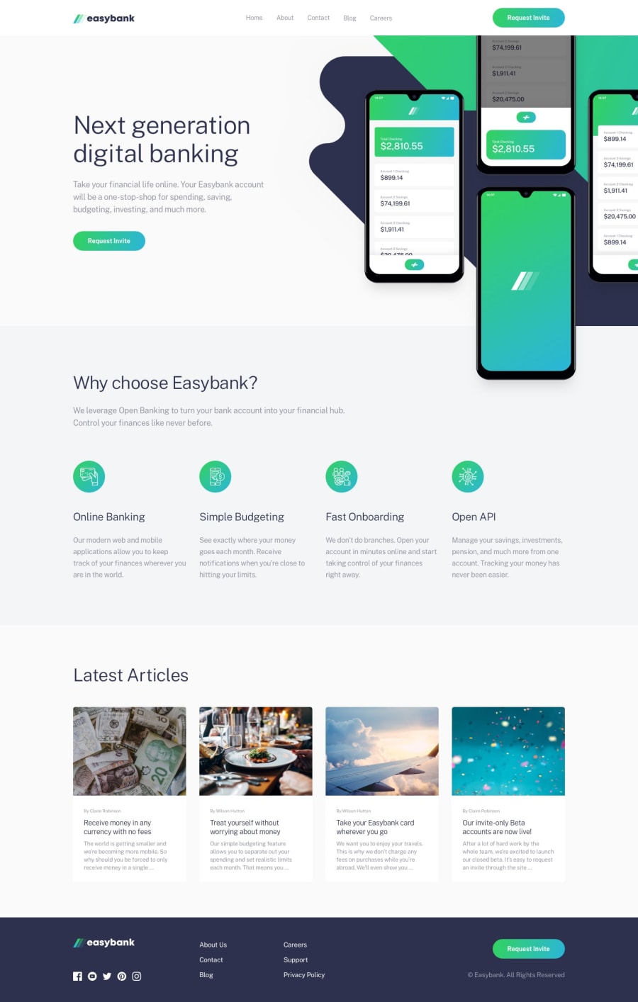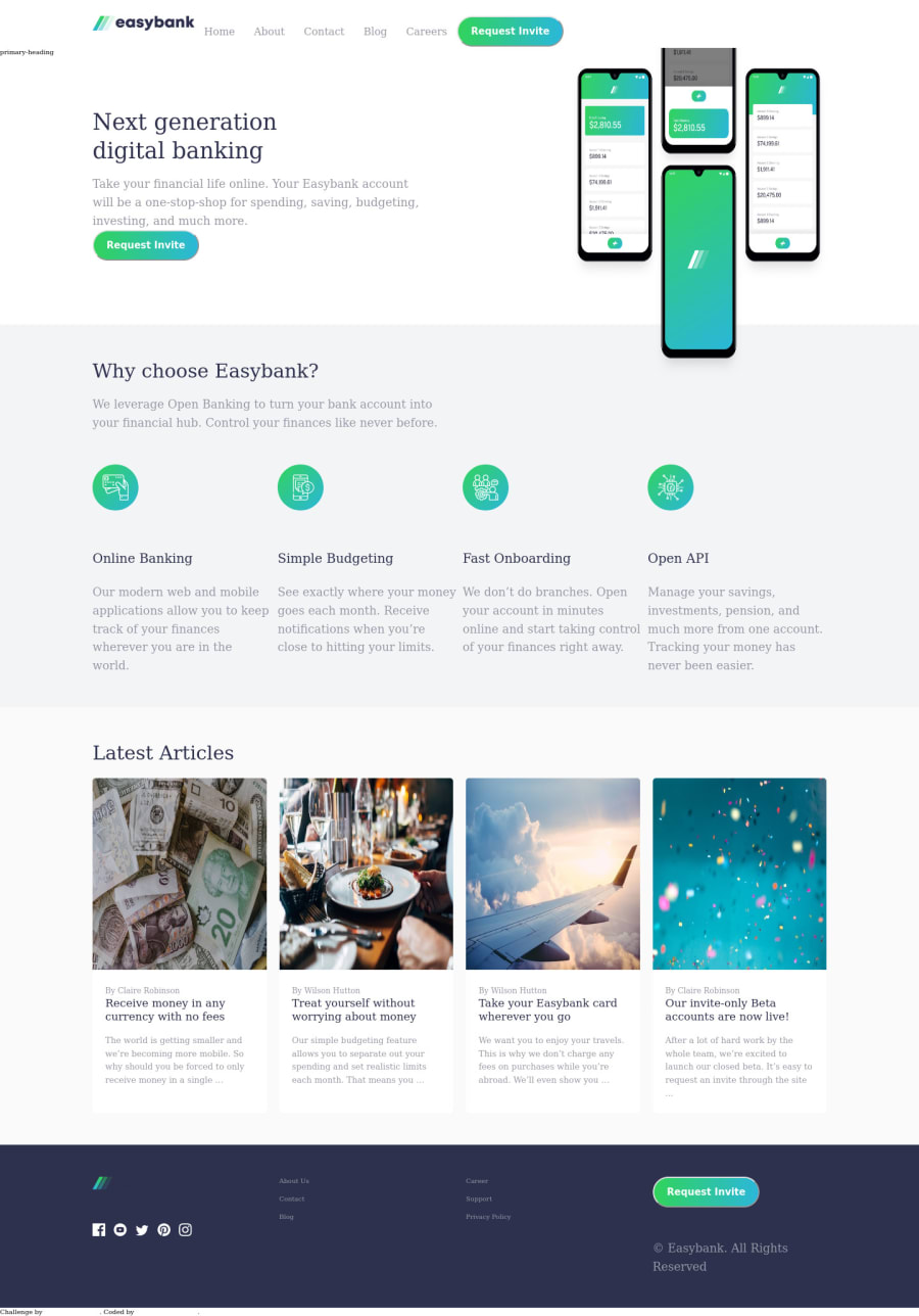
Design comparison
Solution retrospective
It was indeed a great privilege to work on this project. Please I am open to corrections. I had a big problem with aligning my navbar and also using javaScript for the mobile toggle. Please, I will appreciate any simplified method. I am a self-taught developer. Thanks in advance.
Community feedback
- @shashreesamuelPosted over 2 years ago
Hey Eniolufe, good job completing this challenge. Keep up the good work
Your design looks good however I think the image in your hero section of the three phones needs to be a bit bigger, in addition to having a grey and green diagonally striped background. Your footer section is also missing the website name next to the logo and the color of the links are not well contrasted with the background. I suggest referring back to the
style-guide.md
file for reference.In terms of your accessibility issues
-
You cannot nest an
<a>
tag within a<button>
because both are interactive. -
Your links need text in order to make them clickable so you can fix this by specifying a value in the
aria-labelled-by
attribute. -
Wrap all your content within
<main>
tags to get rid of the other accessibility issues
In terms of your validation issues
-
The
<a>
must not appear as a descendant of the<button>
element. This means that you cannot have an anchor tag within a button tag -
You cannot have a space in the value for the
href
attribute.
I hope this helps
Cheers, Happy coding š
Marked as helpful0@EniolufePosted over 2 years ago@TheCoderGuru Thanks so much for the insight and contribution. All noted
0 -
- @Chanda-AbdulPosted over 2 years ago
Try adding
flex-box
andjustify-content
to the navbarlike
display: flex; flex-direction: row; align-items: center; justify-content: space-between;
or
justify-content: space-around;
and
width: 100%;
Hope that helps!
0@EniolufePosted over 2 years ago@Chanda-Abdul thanks so much. I've been trying to see how to fix the navbar. I'll try this out.
0 - @SamadeenPosted over 2 years ago
Remove the primary-heading showing your site.. Your Images are tinier than the sample images You can also Pad out some of your element.. They are too packed. . Overall you did excellently well.. Oil dey your head
0 - @SamadeenPosted over 2 years ago
Great Work on attempting this challenge.. Here are my suggestions
- You dont necessary need to nest an anchor tag inside a button. anchor tag is clickable without the button.
- You can easily place elements and move them around using flexbox or grid
0
Please log in to post a comment
Log in with GitHubJoin our Discord community
Join thousands of Frontend Mentor community members taking the challenges, sharing resources, helping each other, and chatting about all things front-end!
Join our Discord