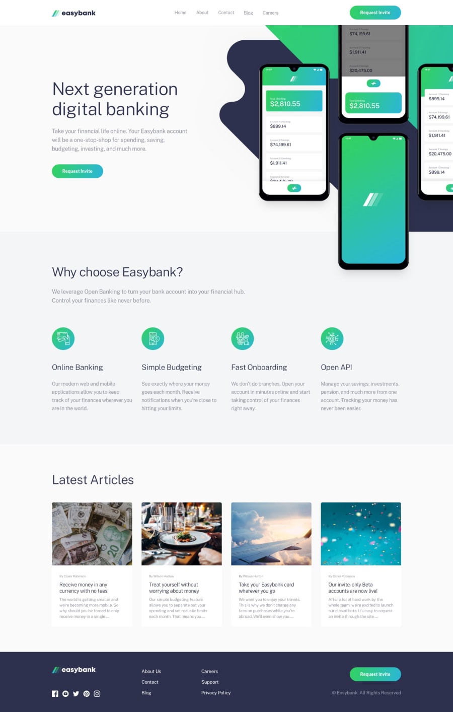
Design comparison
Solution retrospective
I am happy about the layout and the way things are position and how responsiveness of this project and what i will do next is to work on the desktop version more because i feel like the desktop version is not that good but yh
What challenges did you encounter, and how did you overcome them?firstly learning positioning of like absolute and relative was not that easy for the first time but i go through some documentations and videos on youtube and also how to make the hero section of the desktop version was not that easy and i did my best to work on that
What specific areas of your project would you like help with?i will need help on my popup on the mobile version and also on my desktop layout on the hero section and i am also welcome any from of correction
Community feedback
Please log in to post a comment
Log in with GitHubJoin our Discord community
Join thousands of Frontend Mentor community members taking the challenges, sharing resources, helping each other, and chatting about all things front-end!
Join our Discord
