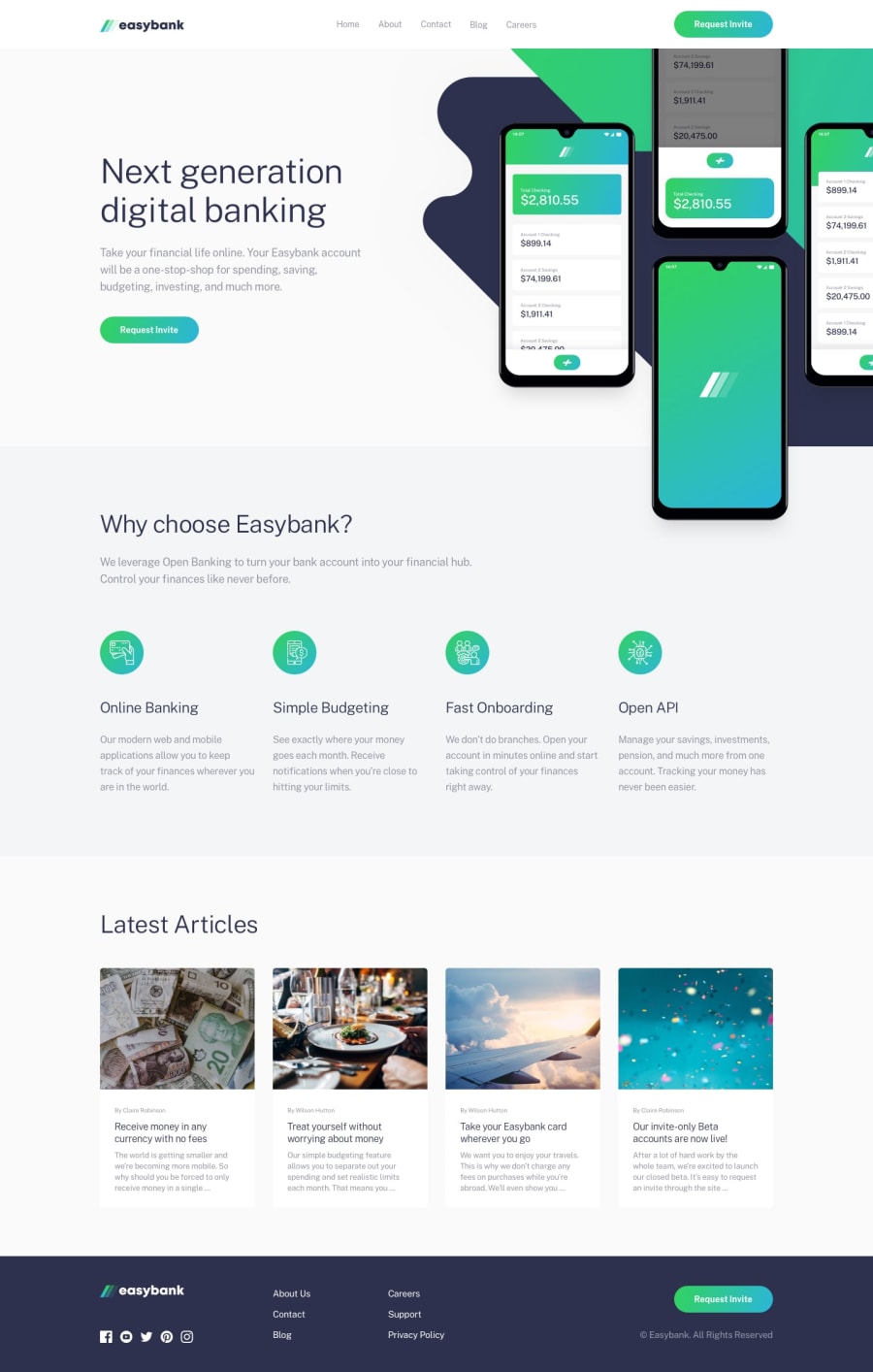
Design comparison
SolutionDesign
Solution retrospective
It was a little bit tricky to position images in header section :) any feedback and suggestions are welcome :)
Community feedback
- @RMI11Posted almost 2 years ago
Hello there! 👋
Congrats for completing the challenge! I'm glad I can learn from you! 🙌
Happy holidays! 🎉✌
1 - @NikolaD93Posted almost 2 years ago
Hi 👋 , love the desing! I have one question hovewer. In the Footer component why did you spread the data array into new array called icons? Isn't the data already an array? Have a good one! 🎉✌
1
Please log in to post a comment
Log in with GitHubJoin our Discord community
Join thousands of Frontend Mentor community members taking the challenges, sharing resources, helping each other, and chatting about all things front-end!
Join our Discord
