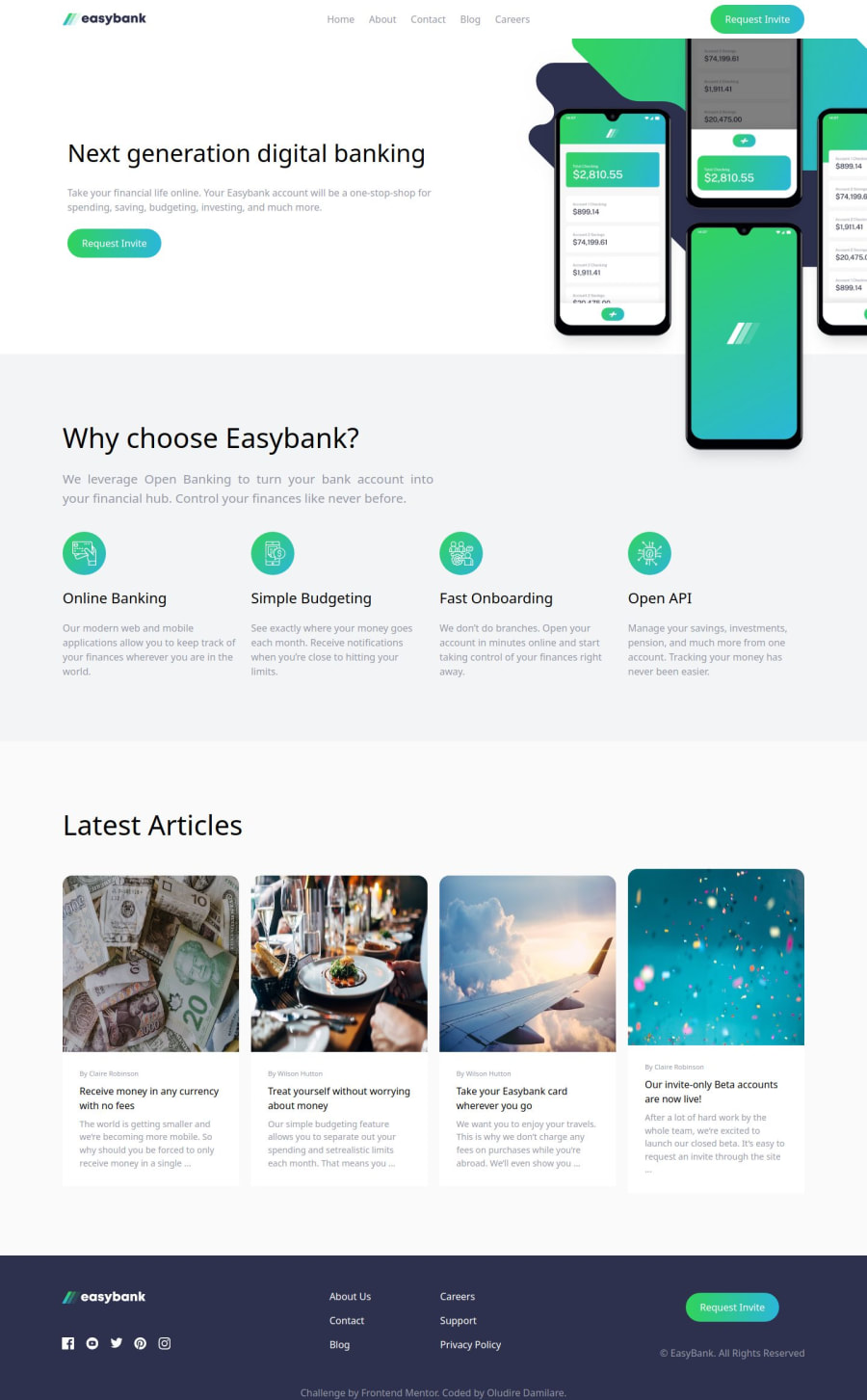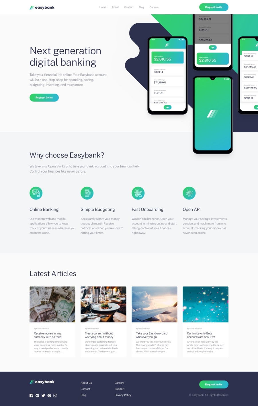
Design comparison
Solution retrospective
I was able to create a landing page and implement some logic with reactJS.
What challenges did you encounter, and how did you overcome them?Using resources online, i was able to apply a linear gradient to the border-bottom of each item in the navigation bar on hovering.
Community feedback
- @kenzycodexPosted 5 months ago
Your solution for the Easy Bank Landing Page demonstrates strong effort and attention to detail. Here are some key points:
Semantic HTML: Your use of semantic HTML elements is commendable, contributing to better accessibility and SEO.
Accessibility: While generally accessible, consider adding ARIA roles and attributes where appropriate to enhance accessibility further, especially for interactive elements.
Responsive Layout: The design adapts well across different screen sizes, ensuring a consistent user experience on various devices.
Code Quality: The code is well-structured, readable, and seems reusable, which is beneficial for maintainability and future updates.
Adherence to Design: The solution closely aligns with the provided design, showcasing your ability to translate visual designs into functional web applications effectively.
Overall, great work! Consider refining accessibility with additional ARIA attributes and ensuring consistent spacing and alignment across different components for a polished user experience.
Marked as helpful0@dareyOGPosted 5 months agothank you very much for the commendations @kenzycodex
1 - @kenzycodexPosted 5 months ago
Your solution for the Easy Bank Landing Page demonstrates strong effort and attention to detail. Here are some key points:
Semantic HTML: Your use of semantic HTML elements is commendable, contributing to better accessibility and SEO.
Accessibility: While generally accessible, consider adding ARIA roles and attributes where appropriate to enhance accessibility further, especially for interactive elements.
Responsive Layout: The design adapts well across different screen sizes, ensuring a consistent user experience on various devices.
Code Quality: The code is well-structured, readable, and seems reusable, which is beneficial for maintainability and future updates.
Adherence to Design: The solution closely aligns with the provided design, showcasing your ability to translate visual designs into functional web applications effectively.
Overall, great work! Consider refining accessibility with additional ARIA attributes and ensuring consistent spacing and alignment across different components for a polished user experience.
0
Please log in to post a comment
Log in with GitHubJoin our Discord community
Join thousands of Frontend Mentor community members taking the challenges, sharing resources, helping each other, and chatting about all things front-end!
Join our Discord
