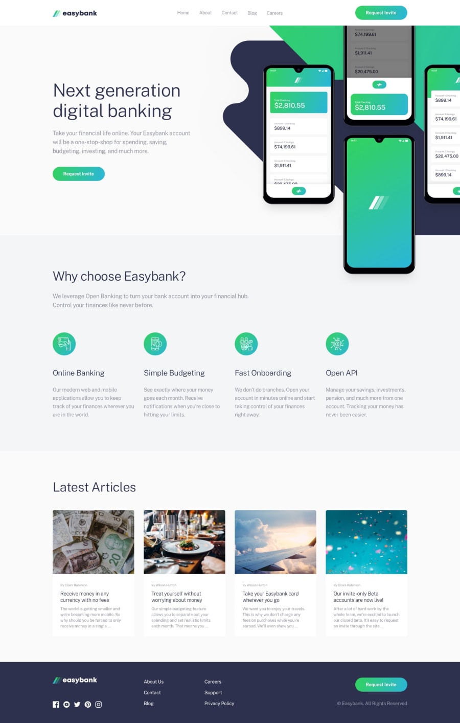
Design comparison
SolutionDesign
Solution retrospective
Figuring out the background images for the main section was challenging due to the overflow of images and getting the positioning right. I still don't think I did it optimally and would love to see other approaches.
Community feedback
Please log in to post a comment
Log in with GitHubJoin our Discord community
Join thousands of Frontend Mentor community members taking the challenges, sharing resources, helping each other, and chatting about all things front-end!
Join our Discord
