Submitted about 2 years ago
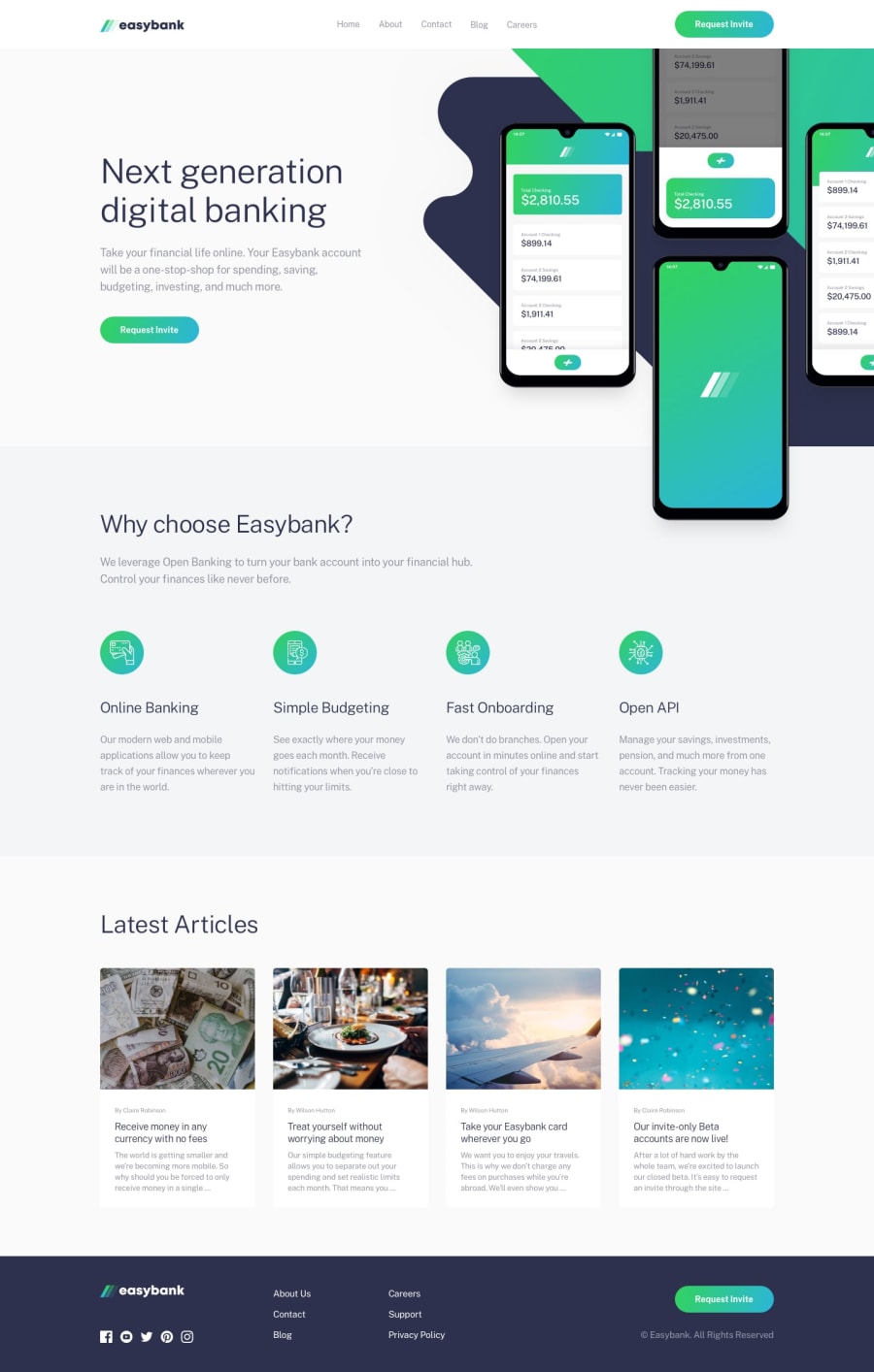
Easybank app responsive using flex box, grid and mobile first
@MonaElshikh
Design comparison
SolutionDesign
Solution retrospective
Hi everyone, i want to share my work with you, will appriciate your comments and modifications.
Thanks alot :)
Community feedback
- @ozchidiPosted about 2 years ago
Unique Project you have out there. Did you intentionally put the hamburger menu on the Desktop screen size?
Marked as helpful0@MonaElshikhPosted about 2 years ago@ozchidi, Hi there, thanks a lot :) The hamburger menu is in mobile screen , the challange has made for 2 screen sizes, 375px and 1440 , any other size will not be displaed properly.
Thanks again :)
0
Please log in to post a comment
Log in with GitHubJoin our Discord community
Join thousands of Frontend Mentor community members taking the challenges, sharing resources, helping each other, and chatting about all things front-end!
Join our Discord
