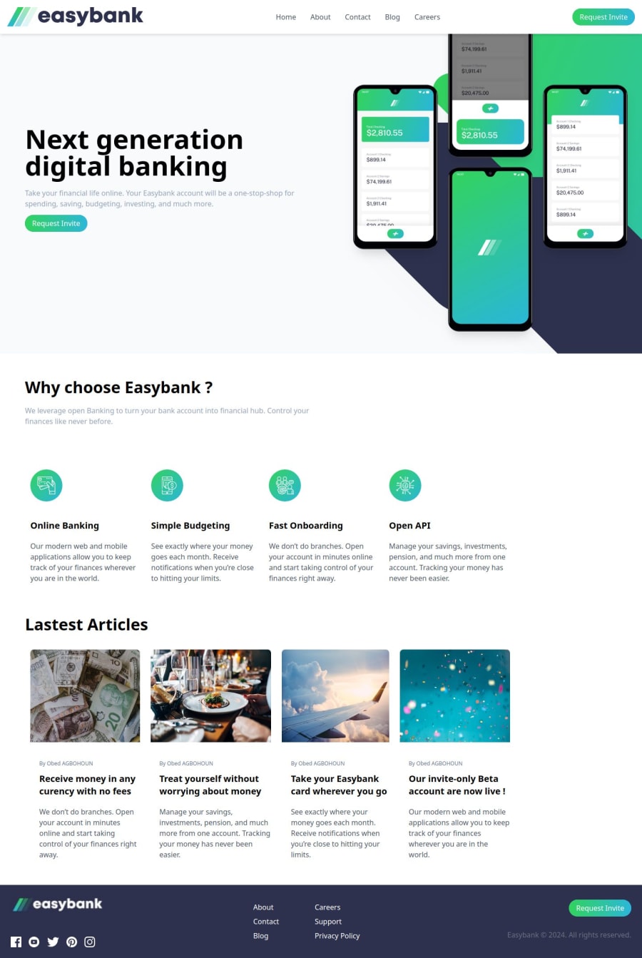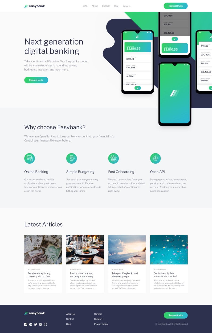
Design comparison
Solution retrospective
For this project, I'm most proud of the smooth user experience and the clean, responsive design that I was able to implement. It was a great opportunity to refine my skills in React, Vite, and Tailwind CSS, while also integrating new tools like react-router-dom and react-icons. The site loads quickly, thanks to Vite's optimization, and I’m particularly happy with how the visual elements and interactions came together, making the site both functional and visually appealing.
If I were to approach this project again, I would focus more on optimizing image handling and file structuring from the start. During the deployment process, I encountered some challenges with image paths that could have been avoided with better initial planning. I would also invest more time in testing different device resolutions and browsers to ensure the experience is consistently seamless across all platforms.
Overall, it was a valuable learning experience, and I’m excited to apply these lessons to future projects.
What challenges did you encounter, and how did you overcome them?One of the main challenges I encountered during this project was related to image handling during deployment. While everything worked smoothly in the local environment, the images didn't display correctly once deployed to Vercel. This issue was caused by incorrect file paths and the difference in case sensitivity between local and production environments. To overcome this, I had to carefully review and adjust the paths to ensure they were accurate and matched the production server's requirements.
Another challenge was optimizing the site’s performance, particularly with loading times. By leveraging Vite’s build optimization features and ensuring that unnecessary assets weren’t included in the final bundle, I was able to significantly improve loading speed.
Lastly, I had to ensure cross-browser compatibility and responsiveness across different devices. I achieved this by thoroughly testing the application on various screen sizes and browsers, making adjustments with Tailwind CSS to ensure a consistent and responsive layout throughout.
Each of these challenges required attention to detail and persistence, but they ultimately led to a better, more polished final product.
What specific areas of your project would you like help with?Here are a few specific areas of my project where I would appreciate help:
-
Performance Optimization: I'd like to explore more advanced techniques for optimizing loading times and overall performance. This includes strategies for code splitting, lazy loading images, and further minimizing bundle size.
-
Accessibility Improvements: Ensuring that my project is fully accessible is important to me. I'd like guidance on best practices for accessibility, including ARIA roles, keyboard navigation, and color contrast checks.
-
Responsive Design: While I've made the site responsive, I'd like feedback on how it performs on various devices and resolutions. Suggestions for improving the user experience on mobile devices would be particularly helpful.
-
State Management: As the project grows, I anticipate needing a more robust state management solution. I'd like advice on when and how to implement a state management library like Redux or Zustand.
-
Testing Strategies: I'd like to learn more about effective testing strategies for React applications, including unit testing and end-to-end testing. Recommendations for tools and best practices would be valuable.
Any insights or resources in these areas would be greatly appreciated!
Community feedback
Please log in to post a comment
Log in with GitHubJoin our Discord community
Join thousands of Frontend Mentor community members taking the challenges, sharing resources, helping each other, and chatting about all things front-end!
Join our Discord
