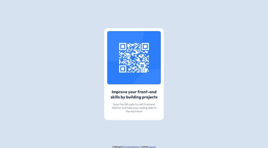
Design comparison
SolutionDesign
Solution retrospective
What are you most proud of, and what would you do differently next time?
This was an extremely easy challenge but it is the first time I have used Figma file to make the design pixel perfect.
What challenges did you encounter, and how did you overcome them?Using Figma tools to measure the dimensions was a small challenge but I figured it out
What specific areas of your project would you like help with?The way I have written my CSS, I wonder if it is standard practice or not? If I have made any mistakes, please let me know so that I can do better in the future.
Community feedback
Please log in to post a comment
Log in with GitHubJoin our Discord community
Join thousands of Frontend Mentor community members taking the challenges, sharing resources, helping each other, and chatting about all things front-end!
Join our Discord
