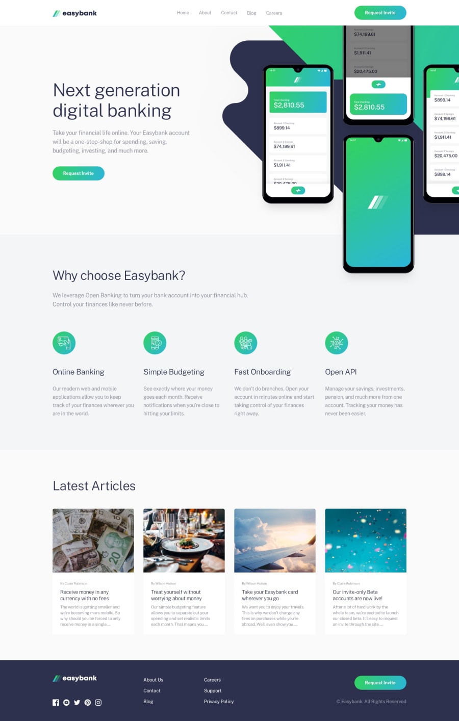
Easy Bank UI with Bootstrap and vanila css
Design comparison
Solution retrospective
Can you give me suggestions about how I can control font size? On desktop, the texts are well but on different mobile devices, the texts break and look horrible.. Please suggest
Community feedback
- @pikapikamartPosted over 3 years ago
Hey, great work on this one. The layout in desktop and mobile is good, though transitioning from desktop to mobile, in the tablet size or some sort, there are huge white spaces, maybe toning it down could be really great.
Davide already said great pointers, just going to add some as well
- your usage of
headercould have been only containing the navbar and not the hero section. The hero section could have been inside and wrapped by amaintag. This will make a good structure, especially for screen reader user, if they navigate in themainlandmark, it will read out yourh1tag. Right now, theheaderlandmark andfooterlandmark are accessible, and yourh1is not really being read like it is intended. - for the hover state of the navbar, if you hover on it, the layout shifts a little up top. What you can do is that, add already the
border-bottombut make its color to be transparent, and then on the:hoverstate, only transition theborder-bottom-color. This way, it won't shake the container. - avoid using
vhon theheightlike what you did in the text of the hero section. If you tinker the dev tools height, the text goes up and down, depending on the screen which is not ideal. Actually, you don't have to add aheighton it, just let it in the flow of the content. - avoid multiple
h1tag. Other tags could have beenh2. Use theh1only on the hero section - on the
Latest Articlessection, those four, could have been wrapped insidearticleelement, and then wrapping the whole in aatag, since it is supposed to be a link that leads to an article a user can read. - on the
footerelement, the easybank logo'salttext should have beeneasybankbecause that is the company's name and is descriptive enough. Also it could have been wrapped insideatag. - the social media icons should have been wrapped inside
atags since they are links. Also it should contain aaria-labelwith the text that depends on what social media it is. Example, `aria-label="facebook"
Other than those, great job.
Also addition. Mobile first workflow is really great to be honest. Now why right? For example, if we start in desktop first, then after a while, we are now going to code the mobile flow right, what we normally does it remove stylings, because a mobile layout is just really a one straight layout compare to desktop first.
Now, if you think of it, why are we removing stylings? Why couldn't we just "add" stylings when we need to. Mobile first solves that. Because your default or base stylings, is for only mobile, a one straight layout. Then if we are transitioning to desktop, you are just adding stylings and it is more correct if you think of it right. One great thought about mobile first.
Also, just use rem:>>>>
Marked as helpful4@AbdullahUCPosted over 3 years ago@pikamart You are great, your suggestions were awesome. I hope, I will try to utilize your suggestions in the next project. Thank you very much. Keep helping.
Happy Programming!
0 - your usage of
- @Da-vi-dePosted over 3 years ago
Hi, it's a nice result for this challenge. That's weird, i tried on my mobile and it's perfect.
- You started the desktop version and you have only a media query in which there's no
font-sizechanges. To avoid any trouble i suggest you to start your projects from mobile version, also forfont-sizeuse rem unit it's best suited. If you don't know rem unit rember 1 rem = default root value (16px, unless you need to change it). Following mobile first approach makes everything easier, you can handle your project much better, especiallyfont-size.
Hope it helps a little, keep coding :-)
Marked as helpful2@AbdullahUCPosted over 3 years ago@Da-vi-de Yes, Now I got the point. So, I need to use rem instead of px.. Is it important to start with mobile version first? What is the benefit of this?
Your Suggestion was awsome, I will try to make changes in my methods.. Thank you very much.. Keep helping.
Happy Programming! :)
1@Da-vi-dePosted over 3 years agoRaymart perfectly answered your question about mobile first!
- I add one more thing that i think is underrated but i went mental for it (in the past when i used to code desktop first), it's using those techniques (flexbox and grid) you need for building a responsive layout. Now, everything goes kind of ok when you work on small, mid-small projects, what happens when you will work on bigger ones? A disaster, if you use either flexbox or grid for the largest width, when you resize the page you need to change the behavior of those techniques and trust me it's really hard, the good thing is that you practice a lot the techniques but you end up taking ages to finish your project that it might be far from good! Mobile first instead helps you to understand better how things work and how they are related!
Happy coding :-)
Marked as helpful1@AbdullahUCPosted over 3 years ago@Da-vi-de Yes, I see. I will try to implement these steps in the next challenge. Thank you very much. Keep helping!!
0 - You started the desktop version and you have only a media query in which there's no
Please log in to post a comment
Log in with GitHubJoin our Discord community
Join thousands of Frontend Mentor community members taking the challenges, sharing resources, helping each other, and chatting about all things front-end!
Join our Discord
