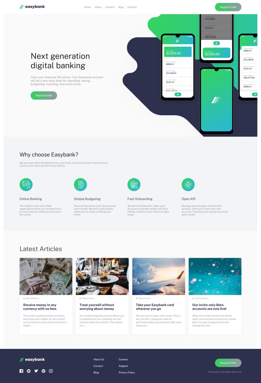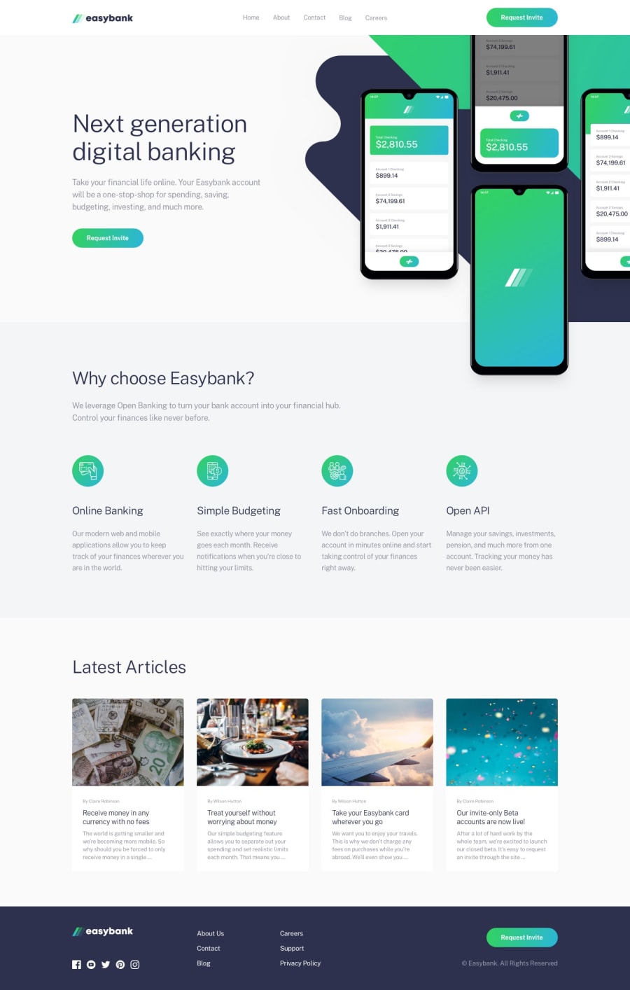
Design comparison
SolutionDesign
Solution retrospective
What are you most proud of, and what would you do differently next time?
I think now I am more familiar with adding elements to the layout and using different rules to adjust them, it was a little easier to play with the placement of elements in the layout, but I still need to practice more.
What specific areas of your project would you like help with?The problem with this project I think is that I did not find a better way to adapt the layout to larger screen sizes.
Community feedback
Please log in to post a comment
Log in with GitHubJoin our Discord community
Join thousands of Frontend Mentor community members taking the challenges, sharing resources, helping each other, and chatting about all things front-end!
Join our Discord
