Design comparison
Solution retrospective
It was my first project using React as I am still learning it. Had some hiccups and looking for tips on fixing:
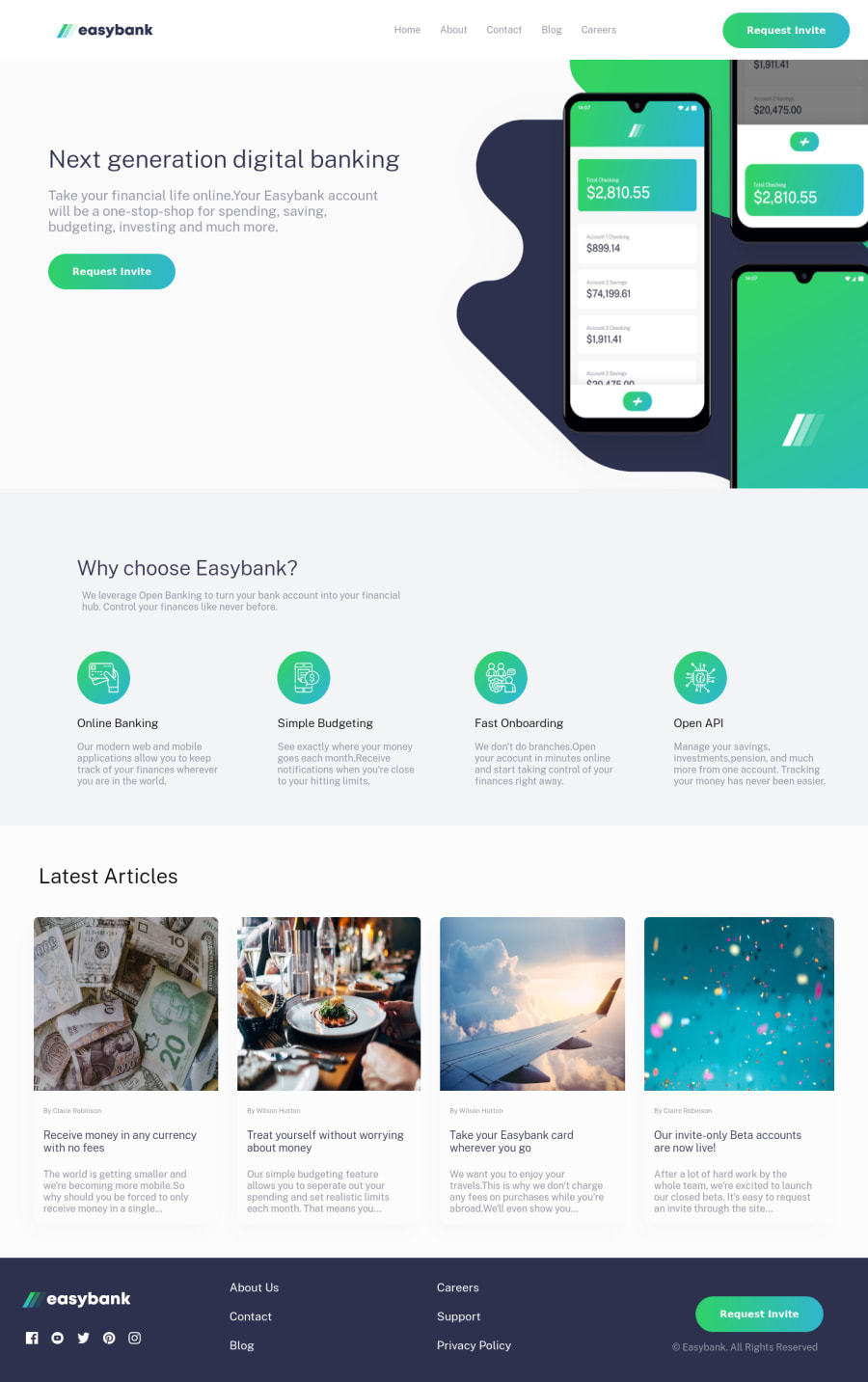
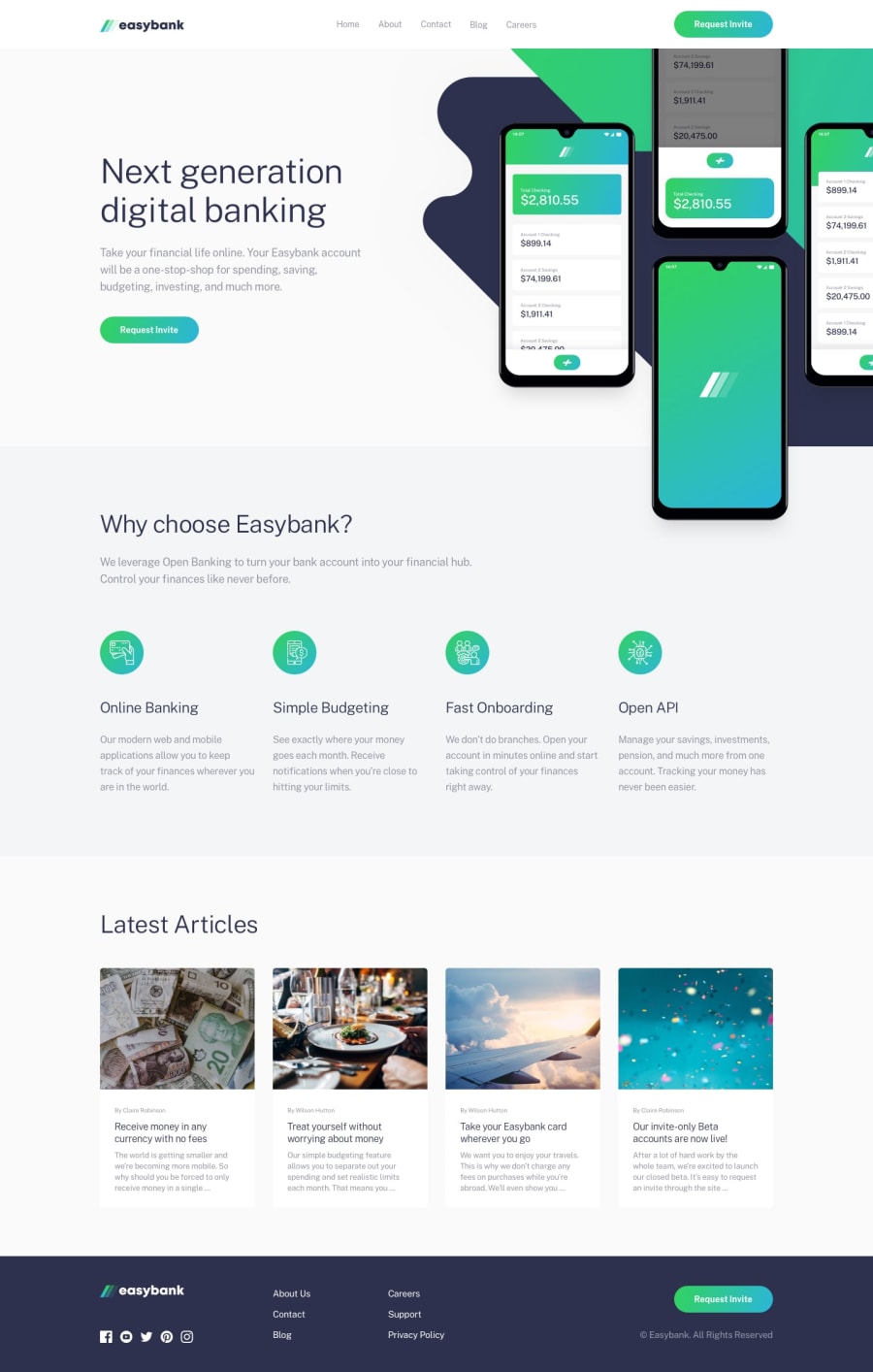
- Hero Mockup image to hover on top of the section instead of being cropped.
- Creating some animation for mobile navigation(also switching hamburger icon to close icon)
Thanks for the feedback! Toms
Community feedback
- @karenefereyanPosted over 3 years ago
Hey, toms, beautiful work. First, you might wanna consider fixing the HTML validation issues. You shouldn't have a SRC attribute in a button. As regards changing the hamburger to close, you could simply just use the transform property. But I think they provide a different close image, so maybe at the point where you're checking whether the mobile menu is shown or not, you could toggle the close button which you gave a close-menu class to. I'm still a beginner at react so my answer is subject to corrections.
Overall, superb work. Keep coding😶😶😶😶
0@ph4ntom5Posted over 3 years ago@karenefereyan thanks a lot for the input and tips! :)
0
Please log in to post a comment
Log in with GitHubJoin our Discord community
Join thousands of Frontend Mentor community members taking the challenges, sharing resources, helping each other, and chatting about all things front-end!
Join our Discord
