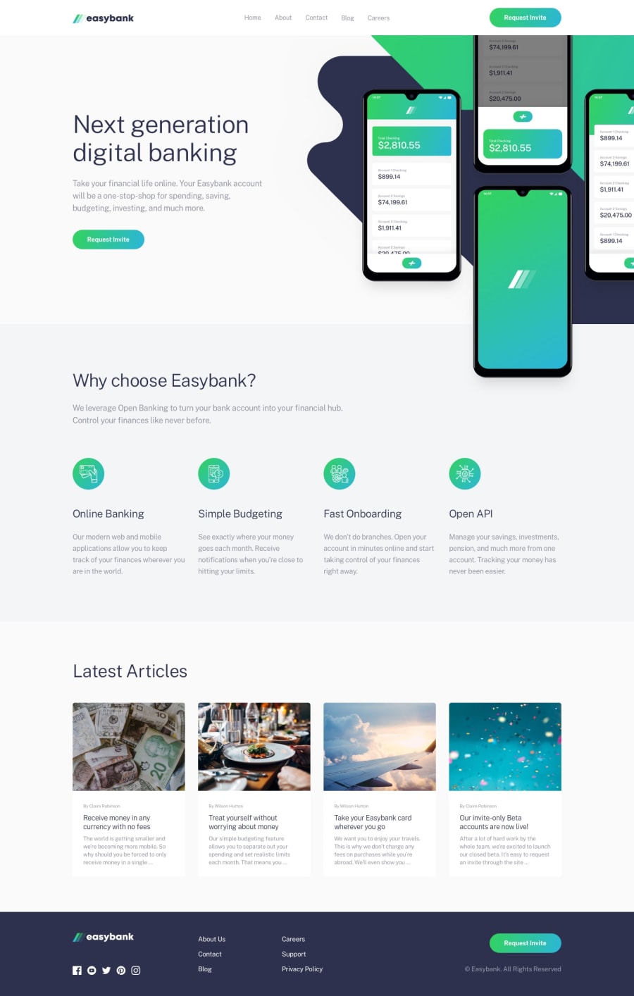
Design comparison
SolutionDesign
Solution retrospective
Feedback will be highly appeciated
Community feedback
- @eminentpalPosted about 4 years ago
Its dope, you did well, your from Nigeria?
0@FunsoAdetolaPosted about 4 years ago@eminentpal
Thanks a lot. Yes, I'm from Nigeria. Are you?
0 - @ApplePieGiraffePosted about 4 years ago
Yes, good job, FunsoAdetola! 👍
Your solution looks good and is responsive! 🙌
I suggest,
- Addin an invisible border-bottom to the navigation links in the header of the page so that the green border that appears when they are hovered over doesn't move the rest of the elements on the page down a bit.
- Adding a hover state to the social media icons in the footer of the page would be a nice touch.
Keep coding (and happy coding, too)! 😁
0@FunsoAdetolaPosted about 4 years ago@ApplePieGiraffe
Thanks a lot for this feedback. Will put your advice to use.
0 - @dhatGuyPosted about 4 years ago
Great job. Looks good on mobile.
0
Please log in to post a comment
Log in with GitHubJoin our Discord community
Join thousands of Frontend Mentor community members taking the challenges, sharing resources, helping each other, and chatting about all things front-end!
Join our Discord
