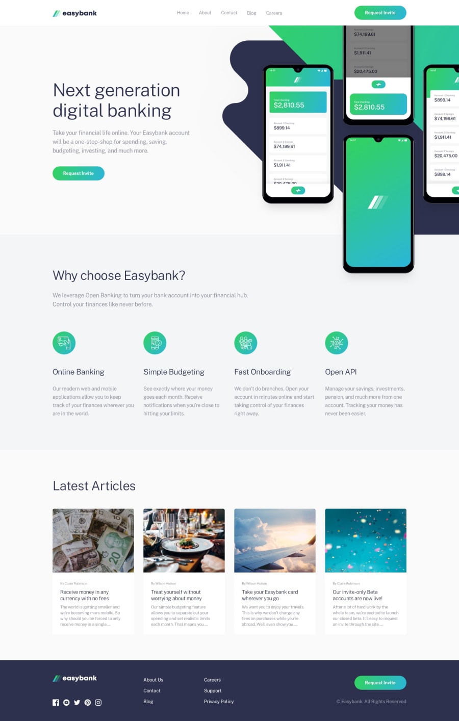
Design comparison
SolutionDesign
Solution retrospective
Why isn't the bg pattern showing on the screenshot? How can I improve my code? I made a mess. Can you give me some good practices for readable code? How would you rate the design? Out of 10? Would appreciate some feedback from experienced developers.
Community feedback
Please log in to post a comment
Log in with GitHubJoin our Discord community
Join thousands of Frontend Mentor community members taking the challenges, sharing resources, helping each other, and chatting about all things front-end!
Join our Discord
