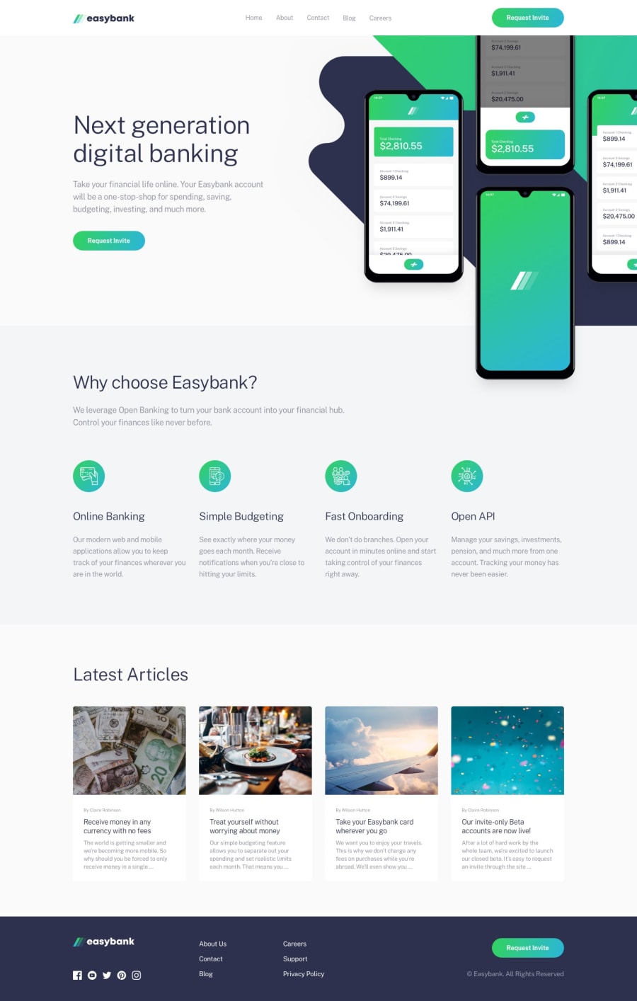
Design comparison
Solution retrospective
Any suggestions would be appreciated.
Community feedback
- @lemreyesPosted about 3 years ago
Hello @ttakeyaya,
Good job on the layout. it is nicely done. Also great work on using proper semantic html.
I noticed though that the hamburger icon becomes a “hamburger” text after i tapped on it. you might want to try resolving those accessibility issues. Axe has devtools extensions for those so you can check it during development.
Overall great work.
Marked as helpful0@ttakeyayaPosted about 3 years agoHello @lemreyes ,
Thank you for all the details.
I fixed the image issue you mentioned. The path to the image was needed to change in the JS file.
Axe DevTools look pretty nice. I'll start using this tool during development!
0
Please log in to post a comment
Log in with GitHubJoin our Discord community
Join thousands of Frontend Mentor community members taking the challenges, sharing resources, helping each other, and chatting about all things front-end!
Join our Discord
