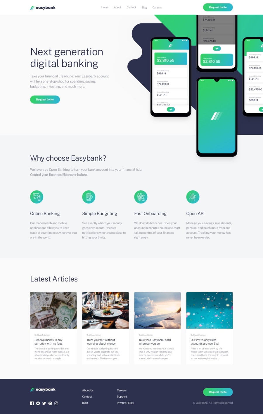
Design comparison
Solution retrospective
Hola amigos,
I have built a full-stack app over this challenge.
The page is in Portuguese, but the documentation in Github is in English, so please check it. As I see it, the most challenging part of this design was to set the mockup illustration with responsivity as the width changes.
Because at the mobile media query it had a width:90svw and in the desktop:
width:600px.
Also, it worked well using flex: 1 0 240px at the card's responsivity.
I'm glad to return to posting on the platform.
If you have any advice for me based on this project, please send it, and I'll be happy to learn from you.
Best regards from Brazil :)
Community feedback
Please log in to post a comment
Log in with GitHubJoin our Discord community
Join thousands of Frontend Mentor community members taking the challenges, sharing resources, helping each other, and chatting about all things front-end!
Join our Discord
