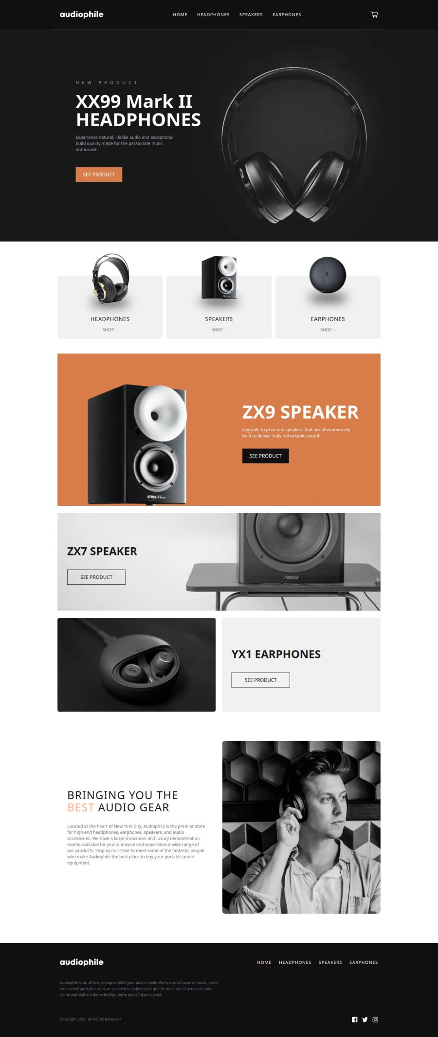
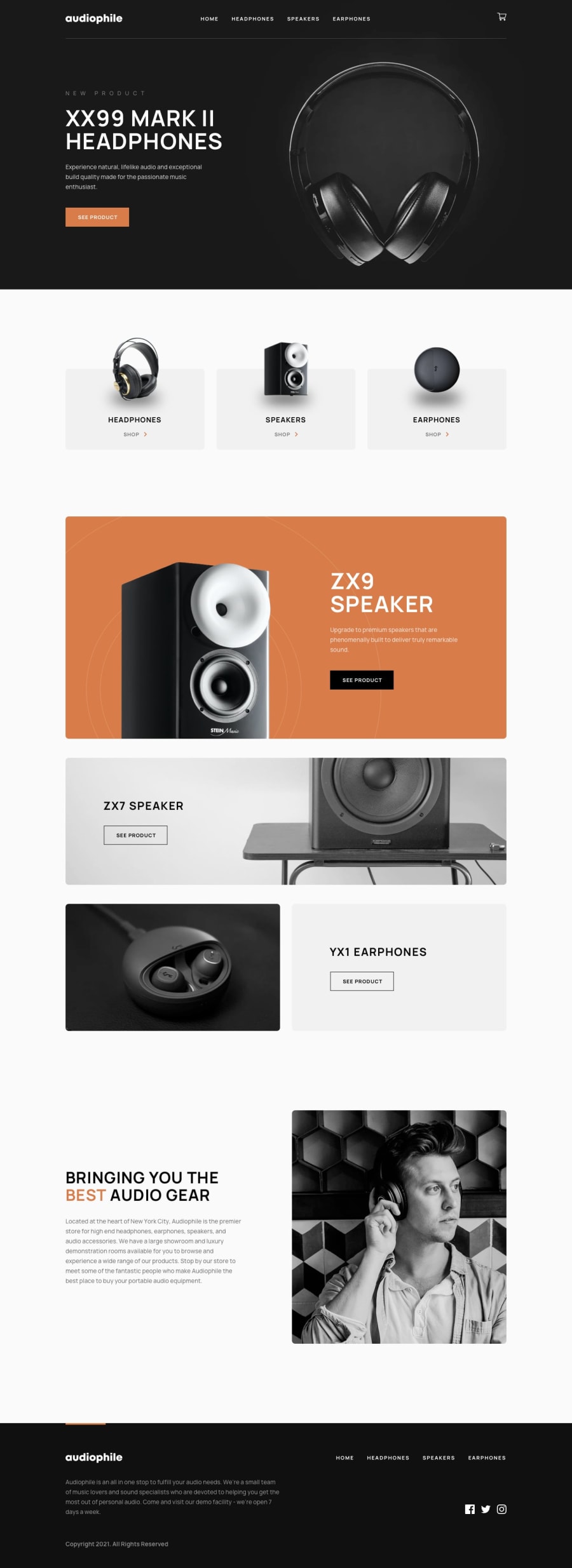
e-commerce website for audio


Design comparison
Community feedback
- @kushil9Posted 3 months ago
Feedback - 1
<div class="bg-secondary text-white w-screen mt-[-32px] h-[90px] sm:h-[132px] flex items-center justify-center text-[24px] sm:text-[32px] mb-8">HEADPHONES</div>I think it would be great to use rem units instead of pixels for the font sizes. This makes the text easier to read and allows it to adjust based on the user's browser settings. Also, instead of using a generic <div>, consider using a semantic heading element. Generic tags like <div> and <span> are mainly to group content together for styling purposes, so it's better to use them only when there aren't any other semantic options.
Feedback - 2
<div class="title">XX99 Mark II Headphones</div>How about using a lighter color for this text? It’s a bit hard to see against the dark background. Also, try using a semantic heading element here. This not only helps with SEO but also creates a meaningful markup which makes your site more accessible for people who use screen readers.
Overall, I think your solution to this project is super cool! Keep it up, and super happy new year Zeyu! 👏🙌
Marked as helpful0@ZoeLong98Posted 3 months ago@kushil9 Happy New Year🥳!! And Thank you for your super helpful advice!
0

Please log in to post a comment
Log in with GitHubJoin our Discord community
Join thousands of Frontend Mentor community members taking the challenges, sharing resources, helping each other, and chatting about all things front-end!
Join our Discord