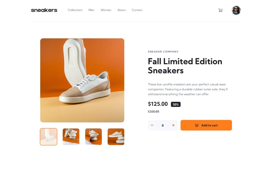
Design comparison
SolutionDesign
Solution retrospective
What are you most proud of, and what would you do differently next time?
Finishing the challenge
Community feedback
- @konradbaczykPosted 3 months ago
Generally good job, I noticed two thing to improve:
- view of the image between ~500px and ~1000px - it doesn't looks good when this image is stretched too much
- no hover on the delete button in cart
0
Please log in to post a comment
Log in with GitHubJoin our Discord community
Join thousands of Frontend Mentor community members taking the challenges, sharing resources, helping each other, and chatting about all things front-end!
Join our Discord
