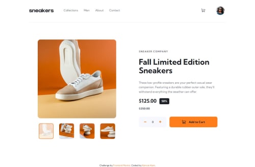
E-commerce Product Page using Astro, Sass and Vanilla JavaScript

Solution retrospective
I am most proud of my efforts to ensure accessibility in my project, particularly in creating a responsive navbar and using dialog elements effectively. Next time, I would definitely use a framework to streamline the development process.
What challenges did you encounter, and how did you overcome them?One of the main challenges was ensuring that the lightbox and cart dialogs were both functional and accessible. I had to pay close attention to various aspects in JavaScript to ensure necessary updates. I overcame these challenges by meticulously adhering to accessibility guidelines and thoroughly testing my code.
What specific areas of your project would you like help with?I would like help with ensuring that my implementation of the lightbox and cart dialogs is as efficient and accessible as possible. Additionally, any feedback on improving the overall accessibility and responsiveness of the navbar would be greatly appreciated.
Please log in to post a comment
Log in with GitHubCommunity feedback
No feedback yet. Be the first to give feedback on Kamran Kiani's solution.
Join our Discord community
Join thousands of Frontend Mentor community members taking the challenges, sharing resources, helping each other, and chatting about all things front-end!
Join our Discord