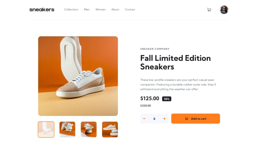
E-commerce product page (React | Typescript | Sass | Vite)
Design comparison
Community feedback
- @kaamiikPosted 3 months ago
Hello, congratulations on successfully tackling this challenge with a framework. I noticed a few points in your project that I would like to mention:
-
When the hamburger icon is open, the page should not be scrollable.
-
For adding items to the cart, it seems you have a number input with two buttons for incrementing and decrementing. This entire structure could be a component.
-
When the lightbox is open and the screen is resized, it would be better if the lightbox closes when the screen becomes smaller.
-
Your page encounters issues at a width of 1069px; I hope you can fix this.
-
When the lightbox is open and the height of the screen is small, scrolling should be possible, but part of the content is not visible.
-
The animations are very nice.
-
When hovering over links in the nav, the text underline is not positioned correctly.
0 -
Please log in to post a comment
Log in with GitHubJoin our Discord community
Join thousands of Frontend Mentor community members taking the challenges, sharing resources, helping each other, and chatting about all things front-end!
Join our Discord
