Submitted 8 months ago
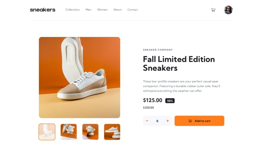
E-commerce product page React, TS, tailwind, zustand
#react#tailwind-css#typescript#zustand#vite
@InnaTymoshenko
Design comparison
SolutionDesign
Solution retrospective
What are you most proud of, and what would you do differently next time?
For practice typescript and tailwind. I used embla-carousel-react for project.
What specific areas of your project would you like help with?Who knows how to adapt images in Vite?
Community feedback
- @aberllinPosted 8 months ago
Hi! There are some issues I've noticed:
- Currently, there's no way to close the Cart modal other than refreshing the page. I recommend adding a close button and/or enabling the modal to close when clicking outside of it.
- The close (X) button does not work if clicked even 0.5 px around it. To improve user experience, I suggest increasing the clickable area around the button.
- The spacing around all elements is quite large. On a 13-inch laptop, I noticed that despite having minimal content on the page, I still need to scroll down to see the
Add to cartbutton. Reducing the spacing could help to make more content visible without scrolling.
Great job overall! Keep it up :)
Marked as helpful0
Please log in to post a comment
Log in with GitHubJoin our Discord community
Join thousands of Frontend Mentor community members taking the challenges, sharing resources, helping each other, and chatting about all things front-end!
Join our Discord
