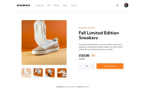
E-commerce product page built w/ React & Tailwind

Solution retrospective
This was my first solo project with React so I am proud of it all in general.
I built it with :
- ❄ React
- 🌄 Tailwind CSS
- 🎊 React Confetti Explosion &
- 🦚🖼React Toastify
I am proud of the little pieces I added to the website especially the confetti explosion at checkout.
What I would do differently ? I don't know if it was because of the project or React but I found it very easy to overlook accessibility (when opening and closing the menu for example or the cart). So I think I will make that a primary focus in upcoming projects.
What challenges did you encounter, and how did you overcome them?I had a hard time when building the gallery. For some reason, I decided to do it with external libraries and it was a pain :(
I finally reflected and realized it won't be so hard to build so I decided to do it on my own and then I saw that it was part of the challenge to build the gallery ourselves. So I built it and it was wayyy easier than I thought.
Please log in to post a comment
Log in with GitHubCommunity feedback
No feedback yet. Be the first to give feedback on Laerice Dessouassi's solution.
Join our Discord community
Join thousands of Frontend Mentor community members taking the challenges, sharing resources, helping each other, and chatting about all things front-end!
Join our Discord