E-Commerce Product Page
Design comparison
Solution retrospective
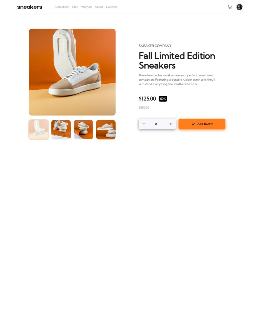
Added a couple of simple but nice transitions.
Normally i go from top to bottom but during development of this challenge i jumped section to section, it might caused some repetitive codes at some places.
What specific areas of your project would you like help with?Any feedback is appreciated.
Just found a bug before posting, it is possible to focus some hidden element and modal with tab button.
Please log in to post a comment
Log in with GitHubCommunity feedback
- P@elisilk
Hi 👋 @KapteynUniverse,
Congrats on a very nice solution. 👏 I like how you incorporated animations/transitions -- especially with the cart, but also more subtle ones like the hover effects on the main navigation menu. Very cool!
And I also appreciate the use of
.sr-onlylabels, such as on the prices and on the input labels, as that definitely increases the accessibility of the page in the cases where the visual styles are not enough. Great work.If you are up for diving in just a little further 🤿, I'd suggest a few things:
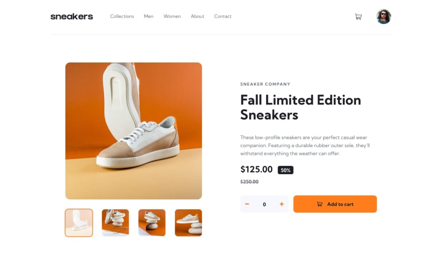
- First, I think a few small design tweaks might make the implementation a little cleaner visually. One that stood out to me are the shadows in your add-to-cart form section. In the design, there is only a small, subtle drop shadow behind the add-to-cart button, and that shadow is present only on the mobile version. And there isn't a shadow at all on the quantity input field (your
.quantityclass) in the design. So here is the drop shadow value that I used for the add-to-cart button based on what was in the Figma design file:
.cart button { box-shadow: 0 20px 50px -20px hsl(26, 100%, 55%); }- Second, I noticed something a little funny when I was looking at your solution at different viewports. Specifically, I started by viewing your solution at a mobile viewport width (
<55em), then scrolled down to the bottom of the page (my screen is not tall enough to see the whole page without vertical scrolling). And then before scrolling back up to the top, I moved to a desktop viewport (>55em). What happens in that case is that the top of the page is no longer visible or scrollable. I think that's because you have the following set on yourbodyelement:
@media screen and (min-width: 55em) {
    body {
        overflow-y: hidden;
    }
}
And I'm guessing you hid that vertical overflow so that you can have the modal lightbox be "hidden" down at the bottom of the page and then animated back up when shown, while preventing any scrolling while it's in the hidden state. Is that right? I certainly understand that choice. And admittedly, I don't think many users will go back and forth between viewports like I did. 🤪
However, if you are looking for alternative ways to get your modal to transition in and out of the screen, I'd recommend you check out two YouTube videos by Kevin Powell:
- "Animate from display none" from April 2022
- "We can now transition to and from display: none" from June 2024
The approach in the second video is super cool but still not fully supported in Firefox browsers and so may not be the best option.
Anyway, just some ideas to consider if you are thinking about improving on this solution. 🤔
Great job overall! Happy coding. 💻
Eli
Marked as helpful - First, I think a few small design tweaks might make the implementation a little cleaner visually. One that stood out to me are the shadows in your add-to-cart form section. In the design, there is only a small, subtle drop shadow behind the add-to-cart button, and that shadow is present only on the mobile version. And there isn't a shadow at all on the quantity input field (your
Join our Discord community
Join thousands of Frontend Mentor community members taking the challenges, sharing resources, helping each other, and chatting about all things front-end!
Join our Discord
