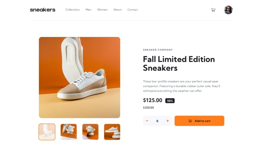
Design comparison
SolutionDesign
Solution retrospective
What are you most proud of, and what would you do differently next time?
Next time I will save the data of products in cart in variables for easier reusable.
Community feedback
- @srijanssPosted 3 months ago
- The solution includes semantic HTML
- Solution is not fully accessible using keyboard, you can enable outline on a, button tags so that keyboard users knows about the active element on the page
- also it would be helpful for screen readers users by adding different aria attributes to define different states in the app e.g popup open/close , add to cart success etc.
- Layout looks good on all screen sizes
- Code is readable, but it can be structured into smaller components for reuse
- Solution differs a bit from the design, the lightbox component is not working
- I liked how you've used animations in menu and slider library for the image gallery
Marked as helpful0
Please log in to post a comment
Log in with GitHubJoin our Discord community
Join thousands of Frontend Mentor community members taking the challenges, sharing resources, helping each other, and chatting about all things front-end!
Join our Discord
