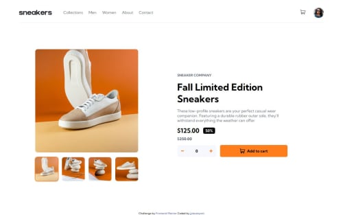
Submitted over 1 year agoA solution to the E-commerce product page challenge
E-commerce product page
accessibility
@jjdavenport

Solution retrospective
What are you most proud of, and what would you do differently next time?
I built the site mobile first and would do the same next time.
What challenges did you encounter, and how did you overcome them?The main challenge was the js especially the lightbox, I also found the layout on the desktop view difficult along with using the correct css for the arrow buttons.
What specific areas of your project would you like help with?Any feedback is appreciated, especially regarding sematic html my js or accessibility.
Code
Loading...
Please log in to post a comment
Log in with GitHubCommunity feedback
No feedback yet. Be the first to give feedback on Jordan Davenport's solution.
Join our Discord community
Join thousands of Frontend Mentor community members taking the challenges, sharing resources, helping each other, and chatting about all things front-end!
Join our Discord