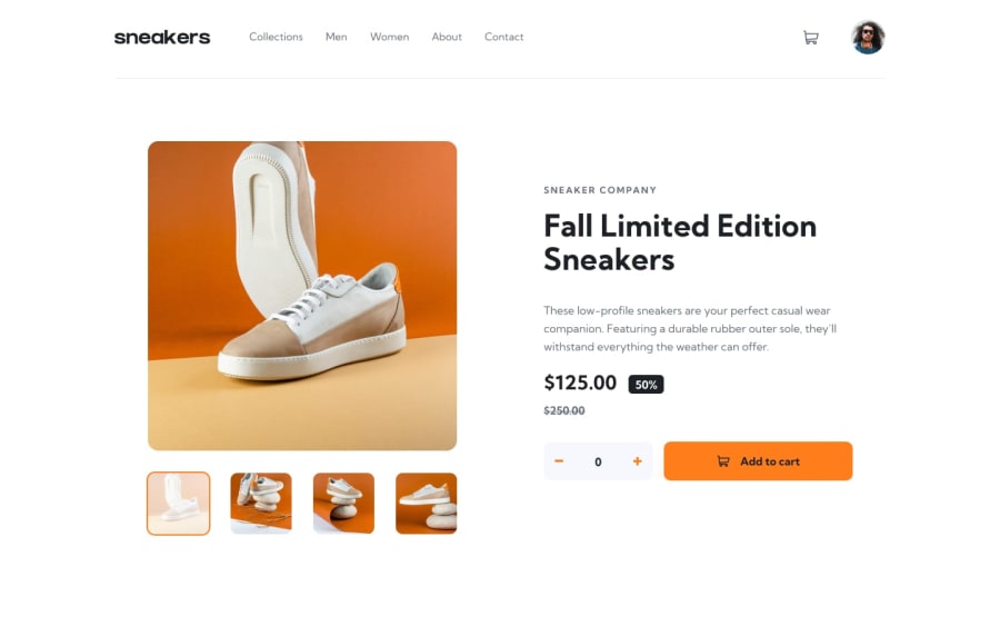
Design comparison
Solution retrospective
I am the most proud that it actually works and looks decent
What challenges did you encounter, and how did you overcome them?It was not and still is not obvious for me how is this thing with slider supposed to be done. Should I have just one? Or is it better to make two of them and replace one with another? How people do things like that? Is there a right way?
Another one concerns the cart. How are things like that done without backend? So i just did what I thought was right. It works, but i would gladly use some advice
What specific areas of your project would you like help with?Js in this project looks terrible and i know that things are not done this way. I would love to see different examples of how other people approach things like this
Community feedback
Please log in to post a comment
Log in with GitHubJoin our Discord community
Join thousands of Frontend Mentor community members taking the challenges, sharing resources, helping each other, and chatting about all things front-end!
Join our Discord
