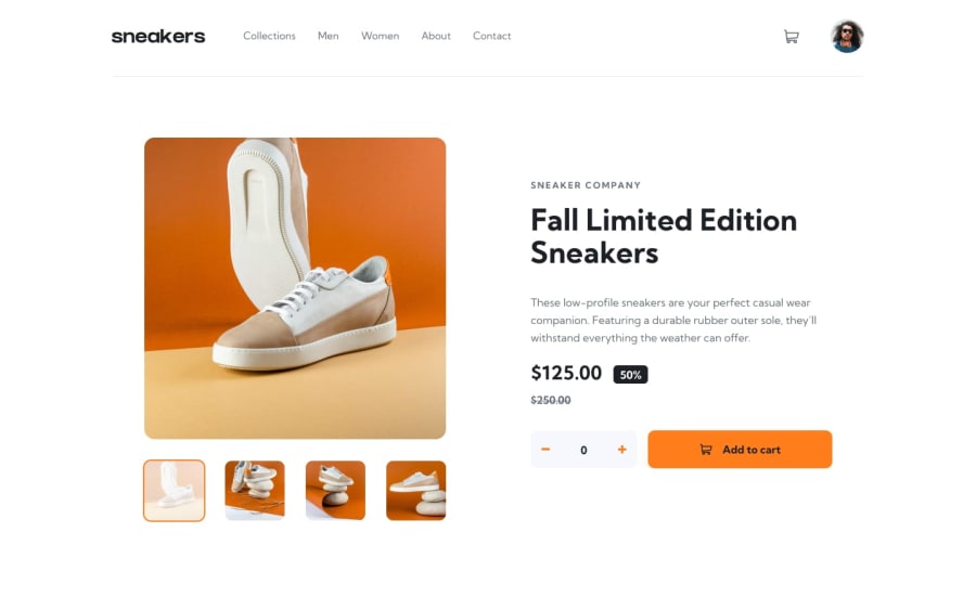
Design comparison
Solution retrospective
I am proud in how the layout turned out, I will redo the JS better later when I can make it more readable and efficient with other technologies.
What challenges did you encounter, and how did you overcome them?the JS of the light box was the hardest, but with some searching I got some snippets that I can use for this project.
What specific areas of your project would you like help with?I think I need help with how to make the js code more readable, because even it's working, the readability is low.
Community feedback
- @echocode1Posted 4 months ago
it a good project and more success. to solve the light box issue you can view my code if you don't mind bas i did that aspect .i have viewed your js code its readable and reusable except that's you nee need to simplify every aspect of code even if it takes longer that should make it more readable
0@Caelus111Posted 4 months ago@echocode1 thanks for actually taking some time and reading my code, I tried making a separate image slider to understand how to make it and I'll rewrite this code later... I will check your solution to get more ideas, I appreciate that brother 😁.
1
Please log in to post a comment
Log in with GitHubJoin our Discord community
Join thousands of Frontend Mentor community members taking the challenges, sharing resources, helping each other, and chatting about all things front-end!
Join our Discord
