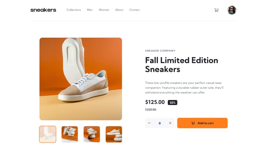
Design comparison
Solution retrospective
It works! The code is a bit messy but I'm happy that it works
What challenges did you encounter, and how did you overcome them?I struggled with the mobile menu, the cart menu, the lightbox, the general layout, making each button do whatever each button had to do, it'd be quicker to ask what i didn't struggle with. but my perseverance will triumph. I bend, but do not break. I whine, and complain, and cry and throw tantrums, but eventually, by sheer luck, through some deus ex machina and never through my actual skills, I reach my goal. i'm so sorry for anyone who actually reads these i'll stop wasting your time
What specific areas of your project would you like help with?is there an easier way to make that side menu thing so that the rest of the screen gets darker and paler when it is open? right now i use a dialog for the menu, and style the rest of the content through js whenever the dialog is showing, because the ::backdrop only works if i make the dialog a modal, but if it is a modal it doesn't stay styled at one side of the screen, but it appears in the center no matter which saint I light a candle to.
Community feedback
- @coder-abdoPosted 5 months ago
your solution is amazing, I love the way you handle the entire application only using native javascript so you have done great, but here are little notes:
- you can make the
overlaywhen clicking themenu iconby usingz-indexwith a high value to cover the whole application. - the lightbox has a vertical scrollbar you need to remove it and you can use
overflow: hiddento prevent this problem. you did an amazing job.
Marked as helpful0 - you can make the
Please log in to post a comment
Log in with GitHubJoin our Discord community
Join thousands of Frontend Mentor community members taking the challenges, sharing resources, helping each other, and chatting about all things front-end!
Join our Discord
