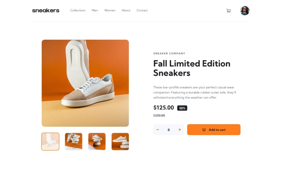
Design comparison
SolutionDesign
Community feedback
- @aouintihouariPosted about 2 months ago
Good job! I loved the hamburger button icon change; however, there's still some room for some minor improvements; for example, in the design, the user should have a rounded border when hovered over, not an underline; also, there's no button to delete the items from the cart; also, the next and previous buttons are too low on smartphone screen size; but you nailed it overall. Great job.
0
Please log in to post a comment
Log in with GitHubJoin our Discord community
Join thousands of Frontend Mentor community members taking the challenges, sharing resources, helping each other, and chatting about all things front-end!
Join our Discord
