

Design comparison
SolutionDesign

Community feedback
- @BunchydoPosted 3 months ago
Hi gowthamjk08,
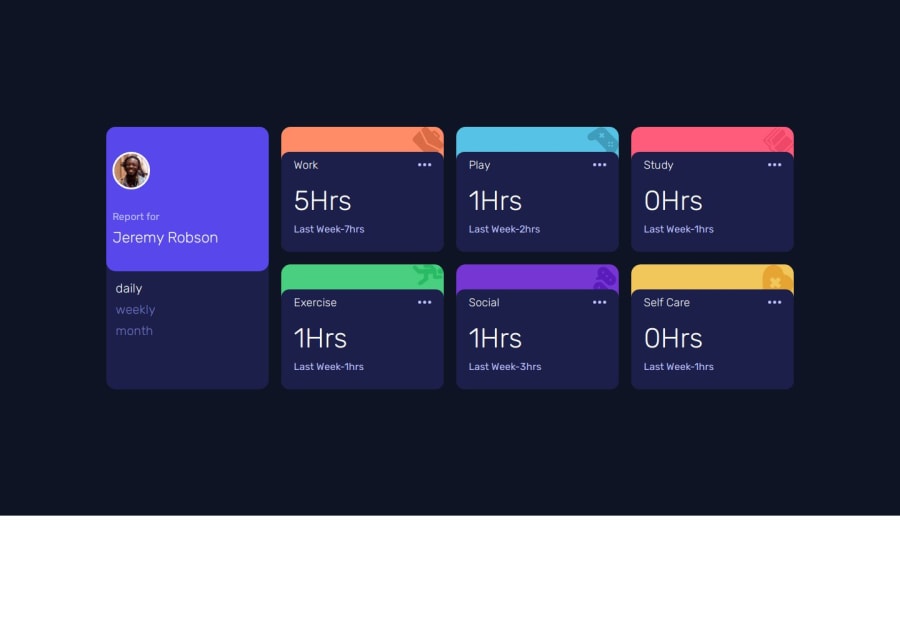
I noticed that the daily, weekly, and monthly selectors could benefit from some alignment adjustments. It would be great to have them centered but aligned to the left for a more organized and visually balanced layout based on the design given
Marked as helpful0

Please log in to post a comment
Log in with GitHubJoin our Discord community
Join thousands of Frontend Mentor community members taking the challenges, sharing resources, helping each other, and chatting about all things front-end!
Join our Discord