Submitted almost 3 years agoA solution to the Results summary component challenge
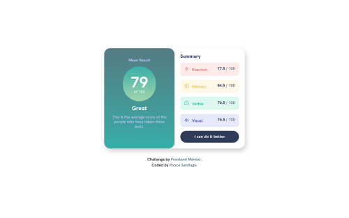
Dynamic Results summary component
bem, accessibility
@SantiagoPonce

Solution retrospective
Hi! 😀
After a while without doing any exercise I wanted to get the most out of it. I was really pleased with the results and the dynamism added
- You can enter your score
- The page will inform you how well you did compared to the other (fictitious) users loaded in a json file
(although the documentation and js functions need to be improved) Another aspect to improve could be to make the "Great" qualifier dynamic (which can be too optimistic 🥳 even if our rating is very low)
Any suggestion is welcome :) Have a good day!
Code
Loading...
Please log in to post a comment
Log in with GitHubCommunity feedback
No feedback yet. Be the first to give feedback on Zosima's solution.
Join our Discord community
Join thousands of Frontend Mentor community members taking the challenges, sharing resources, helping each other, and chatting about all things front-end!
Join our Discord