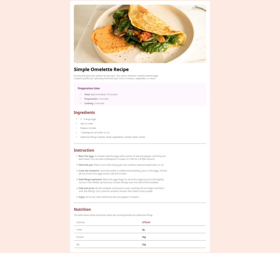
Design comparison
Solution retrospective
Learning new techniques always improves my way of solving problems alone... I know this is a great platform for anyone who is willing to learn from scratch. looking forward to get some help on this project.... thanks
Community feedback
- @EllyMarcPosted about 1 month ago
Hello! I noticed that you had some problems centering the main part of the page. Maybe if you put all the main content inside a <main> or a div with some special id, it would be better organized. After that, in CSS, you can set the <body>:
- “width: 100%” to take up the entire width of the screen;
- “min-height: 100vh” so that it takes up 100% of the browser screen;
- “display: flex” so that it can be arranged freely;
- “justify-content: center” and “align-items: center” to center whatever is inside this element, in this case, the special div called main.
Also, perhaps it would be interesting to use “em” as the unit of measurement for the font instead of “px” and try to be more faithful to the font sizes required by the challenge. Other than that, it was a great solution. Proud!! :)
0
Please log in to post a comment
Log in with GitHubJoin our Discord community
Join thousands of Frontend Mentor community members taking the challenges, sharing resources, helping each other, and chatting about all things front-end!
Join our Discord
