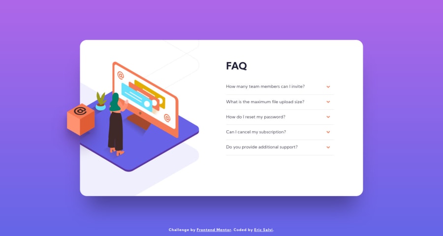
Dynamic FAQ accordion card using absolutely no JavaScript!
Design comparison
Solution retrospective
Just a heads up, the original design was not centered around the card but rather around the card and the box icon poking outside of the container.
I fixed it in my own version so that the card is centered as how it should be. My screenshot looks off because of this.
Feedback always is helpful in general.
Community feedback
- @tedikoPosted over 3 years ago
Hello, Eric Salvi! 👋
Good effort on this challenge! Your solution responds well. I wouldn't care about this screenshot too much. I really like that you think about putting your arrow images in CSS instead keeping it in HTML code. The only detail is since you hide your radio inputs with
display: none
i can't focus this elements with my keyboard. Maybe find other way to hide these radio inputs so user can still access them. (To see what I mean: remove display from inputs and tab through your page, when you focus first element use arrows to navigate through all tabs).Good luck with that, have fun coding! 💪
1@ericsalviPosted over 3 years ago@tediko Great catch. Thank you so much for the accessibility functionality that was missed.
I have since updated my code and it looks to be able to be toggled with tab and using the arrows now.
0@tedikoPosted over 3 years ago@ericsalvi Yes, great job! Now you can add some
:focus
selector on radio inputs and style within label with outline, or something to show user when he select this input.1
Please log in to post a comment
Log in with GitHubJoin our Discord community
Join thousands of Frontend Mentor community members taking the challenges, sharing resources, helping each other, and chatting about all things front-end!
Join our Discord