

Design comparison

Solution retrospective
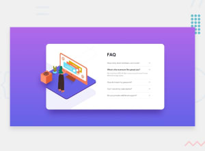
My first JS challenge! Any feedback is welcomed. Thank you.
Community feedback
- @AgataLiberskaPosted over 3 years ago
Hi @mathew12tan, congrats on your first JS challenge, well done! Here's what I noticed:
-
it would be good to add some margin on the bottom on mobile devices - on smaller viewports the card reaches right to the bottom of the screen. Adding some space will make it look more professional :)
-
If you use divs as the clickable element, it won't be accessible to keyboard users. Try using a button instead - this is my favourite article about this
-
It would be great if there was some animation/transition to reveal the answer, but the display property is not animatable. One way to work around this would be to create a keyframes animation that animates both display and opacity, or you could just try to toggle between
height: 0toheight: max-content;
Hope this helps :)
1@mathew12tanPosted over 3 years agoHi @AgataLiberska,
Thank you very much on your time to comment on my solution.
I edited my code on mobile view, using button for click event, added transition to reveal answer, change my approach on images and minor details..
Thank you again 😊, Mathew
0 -

Please log in to post a comment
Log in with GitHubJoin our Discord community
Join thousands of Frontend Mentor community members taking the challenges, sharing resources, helping each other, and chatting about all things front-end!
Join our Discord