Design comparison
SolutionDesign
Community feedback
- @shivaprakash-sudoPosted about 2 years ago
Hello Jordi Mantilla,
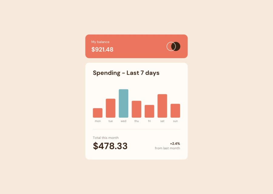
The chart component itself is looking good, but unfortunately I'm not able to see the generated chart.
I just checked in Edge browser and it is miraculously working!😂 I think the problem was with the Firefox browser, because I get the following error in my console, when I checked for any errors.
Uncaught SyntaxError: import assertions are not currently supported. So lookout for these kind of things and try to do cross-browser testing.Anyway, after checking the bar chart in Edge, I have few suggestions.
- The bars could use some width in bigger screens, they look too skinny on my laptop screen😅.
- The hover states are working fine, but all of them are at the same height, which in my opinion, doesn't make sense in user experience wise. Also, in the design they're just above the bar, so try to achieve that. This can be done by putting the money positioned absolute to it's respective bar.
- Try to update your readme file using the readme template given along with the project files. It helps when someone else is looking at your repository.
- Try to wrap the card using more semantic tags like
section,articleetc., and the attribution usingfooter.
Keep up the good work!😊
Marked as helpful0
Please log in to post a comment
Log in with GitHubJoin our Discord community
Join thousands of Frontend Mentor community members taking the challenges, sharing resources, helping each other, and chatting about all things front-end!
Join our Discord
