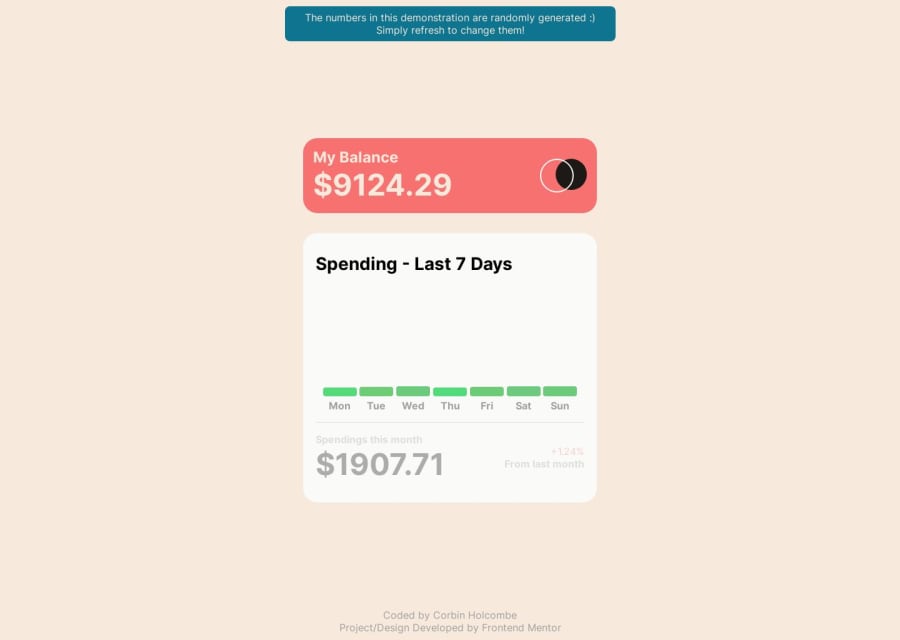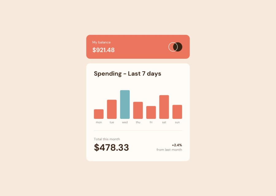
Design comparison
Solution retrospective
I had a great time diving into this project. It was a nice change of pace to work on something a bit simpler, giving me the space to inject my creative flair into it. I've put together some notes about my thought process and how I tackled the project in the GitHub repo. I'd love for you to check it out and get a glimpse into my approach. Feel free to swing by and see how it all came together!
Community feedback
- @BlackpachamamePosted 11 months ago
Hey your solution is amazing! 🤩 It looks pretty, pleasant and original.
📌 Some accessibility and semantics recommendations for your HTML
- Just because it looks bigger does not mean that this text is your main title
- There can only be one
h1per page - The
min-width: 100vwof thebodygenerates a horizontal scroll for me, and I also think it is unnecessary
That's all I can say, you've done an excellent job 😎
Oh! By the way, I'm going to take the time to read your README and see how your step by step went, it seems interesting.
Marked as helpful1@CorbinholPosted 11 months agoThanks for the kind words! ^^ I appreciate the advice @Blackpachamame
0
Please log in to post a comment
Log in with GitHubJoin our Discord community
Join thousands of Frontend Mentor community members taking the challenges, sharing resources, helping each other, and chatting about all things front-end!
Join our Discord
