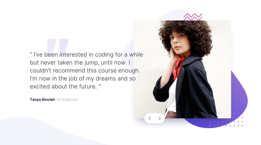
Design comparison
SolutionDesign
Solution retrospective
I tried many things with different html layout, CSS and JS code for this challenge.
As for now, settled with this version.
This version can be used for more than two testimonials.
I also made the left and right button responds differently. Testimonial will slides from right to left when left button is clicked and vice versa.
Appreciated any feedback to improve/simplify my code, especially JS code.
Thank you.
Community feedback
Please log in to post a comment
Log in with GitHubJoin our Discord community
Join thousands of Frontend Mentor community members taking the challenges, sharing resources, helping each other, and chatting about all things front-end!
Join our Discord
