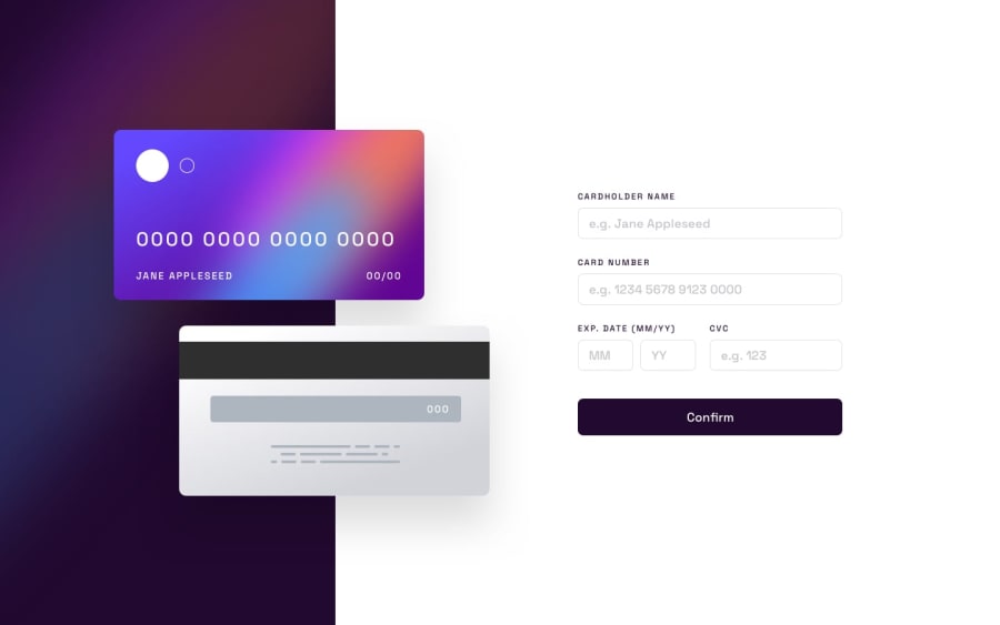
Design comparison
SolutionDesign
Solution retrospective
Hey guys! I'll appreciate your feedback!
It's my first time when I worked with forms, so, validation was quite challenging for me :)
Community feedback
- @AdrianoEscarabotePosted about 2 years ago
Hi Nikita, how are you?
I really liked the result of your project, but I have some tips that I think you will enjoy:
- To improve the accessibility of the project you could have put an h1. Every page must contain a level 1 header, for people who use screen readers, identity what the main title is.
- every Html document must contain the main tag, so we can identify the main content, to fix this, wrap all the content with the
maintag.
The rest is great!
I hope it helps... 👍
Marked as helpful1@WhalelessPosted about 2 years ago@AdrianoEscarabote, Thank you a lot! I'll improve this project following your advice :)
1
Please log in to post a comment
Log in with GitHubJoin our Discord community
Join thousands of Frontend Mentor community members taking the challenges, sharing resources, helping each other, and chatting about all things front-end!
Join our Discord
