

Design comparison

Solution retrospective
This was quite a long project that took me about a month to complete. Unfortunately, due to holidays and my workload, I couldn't dedicate as much time as I wanted, but I'm happy to have finished it in the end. The HTML and CSS parts were fairly straightforward. In JavaScript, I spent the most time on the lightbox. Initially,
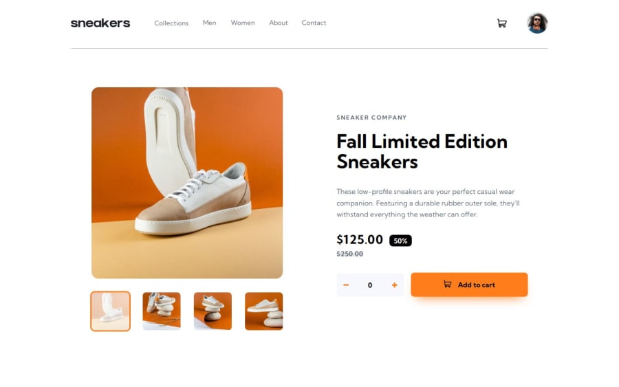
Additionally, instead of creating a product with only static text, I structured it as an array to make it appear as if the product data came from an API. I defined all the information there, which allowed me to reuse and modify the same variables across multiple places.
As for features outside the original project plans, I developed a system where items are dynamically added and removed instead of just using a standalone trash bin. (I noticed this approach is common in many e-commerce sites.) Also, items added to the shopping cart disappear after a certain period but reappear when you hover over the cart icon.
Initially, I planned to add a dark mode as well, but I decided to skip it because I wanted to finish the project. Maybe I'll implement it in my next project.
What challenges did you encounter, and how did you overcome them?I wanted to use the same lightbox element for the mobile view, but when I couldn't make it work, I ended up planning it as a separate element.
What specific areas of your project would you like help with?Open to any and all suggestions
Community feedback
- @Andigashi1Posted 2 months ago
Hi i love the site and the detail to the animations, i only have a small suggestion. Add a max width for mobile so this way the image looks better on larger screens that dont include desktop view and the text and buttons too. Good luck on the next projects
0

Please log in to post a comment
Log in with GitHubJoin our Discord community
Join thousands of Frontend Mentor community members taking the challenges, sharing resources, helping each other, and chatting about all things front-end!
Join our Discord