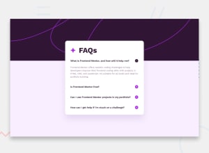
Dynamic & responsive FAQ accordion (Mouse and keyboard navigation)
Design comparison
Solution retrospective
The thing that I'm proud the most was the keyboard navigation feature that was implemented.
It was, apart of being the most difficult part, it was also the most interesting as it allows you to comprehend how several DOM components of the project works and how are accessed and used to make certain actions.
What challenges did you encounter, and how did you overcome them?At the beginning was implementing the different backgrounds depending on the device screen, in addition, the creation of the keyboard navigation as a way of accessibility
Organizing the scopes of the functions made in javascript was kind of a headache, but discovering that when they're used properly and in the right scope they lead to success.
What specific areas of your project would you like help with?I'd like to have help with one feature which is hiding the other elements (if they're opened) after being clicked by the user
Community feedback
Please log in to post a comment
Log in with GitHubJoin our Discord community
Join thousands of Frontend Mentor community members taking the challenges, sharing resources, helping each other, and chatting about all things front-end!
Join our Discord
