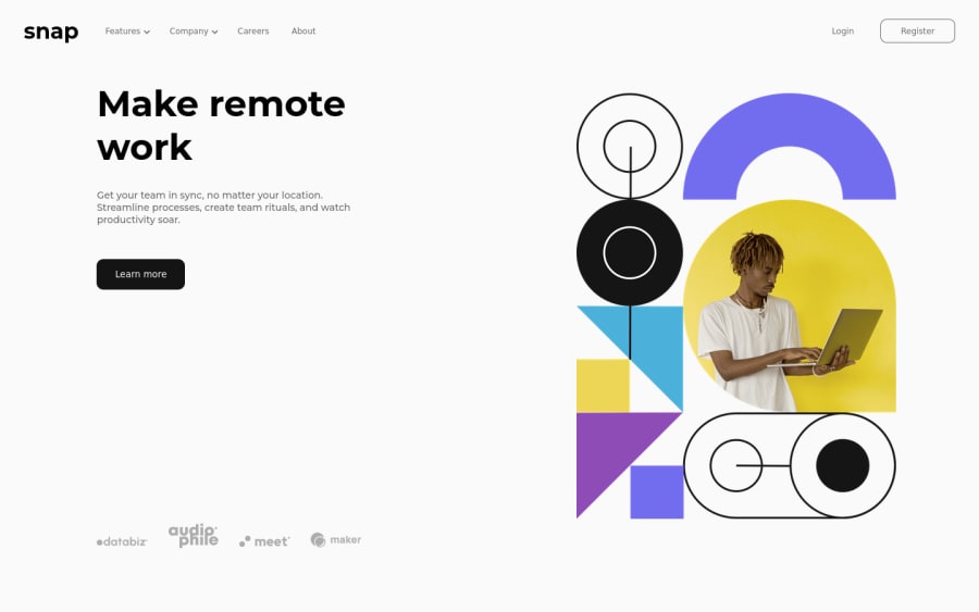
Design comparison
SolutionDesign
Solution retrospective
I finally finished this project. I wish I could do better. I don't know how to optimize my code. I used the 'memo' hook but In the Navigation component, there is too much-repeated code. Also, I couldn't apply the background color transition to mobile design.
Community feedback
- @shivaprakash-sudoPosted about 2 years ago
Hello sagekim6,
I've tried to check the live site, but it seems like the styles and the images are not loading on to the site.
- This could be due to path issues when you're trying to link them into the html file.
- You need to convert the scss to css and then link the CSS file, not scss file.
- Why are you using
js
as file extensions when using react? - Try to start with mobile screens first and then go for larger screens. This way there are no need of many media queries.
- Also, try to use
min-width
in media queries, instead ofmax-width
.
Good luck!
Marked as helpful0
Please log in to post a comment
Log in with GitHubJoin our Discord community
Join thousands of Frontend Mentor community members taking the challenges, sharing resources, helping each other, and chatting about all things front-end!
Join our Discord