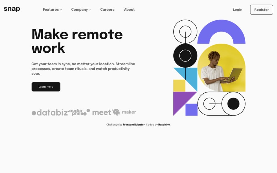


Design comparison

Solution retrospective
Hello everyone. This is the first challenge where I really challenged myself to find solutions, to try and then to fail (a lot). That made me crazy is the burger menu, I spent an indecent amount of time there. There are still a lot of things missing. The close button doesn't appearing. Moreover, I haven't found how to put a shadow on the left when the menu opens if you can give me some hints !
Community feedback
- @AdrianoEscarabotePosted about 2 years ago
Hi Lea, how are you?
I really liked the result of your project, but I have some tips that I think you will enjoy:
To make the close button on the
burguer menuappear, we can do this:First take the element you want to manipulate and store it in a variable, then we will add a conditional structure, which will check if the menu has a
classList, and if it returns true the element will have itssrcattribute changed:function toggleMenu () toggle.addEventListener('click', () => { menu.classList.toggle('open-nav'); if (menu.classList.contains('open-nav')) { imgMenu.setAttribute("src", "images/some-name.svg") } else { imgMenu.setAttribute("src", "images/name.svg") } }); }The rest is great!
I hope it helps... 👍
Marked as helpful0@HatchinoPosted about 2 years agoHi @AdrianoEscarabote, Thanks but the program doesn't work. When i click the menu no longer closes.
1@AdrianoEscarabotePosted about 2 years ago@Hatchino i add:
<img src="images/icon-close-menu.svg" class="open" alt="icon-menu-open" id="imgMenu">const imgMenu = document.getElementById("imgMenu") function toggleMenu() { const menu = document.querySelector('.menu'); const toggle = document.querySelector('.toggle-menu'); toggle.addEventListener('click', () => { menu.classList.toggle('open-nav'); if (menu.classList.contains('open-nav')) { imgMenu.setAttribute("src", "images/icon-close-menu.svg") } else { imgMenu.setAttribute("src", "images/icon-menu.svg") } }); } toggleMenu()test and let me know!
Marked as helpful0@HatchinoPosted about 2 years agoThanks @AdrianoEscarabote it works ! Do you know why my responsive menu appears directly without having clicked on the toggle.
0@AdrianoEscarabotePosted about 2 years ago@Hatchino this your media query:
@media (max-width: 840px)
.open-nav {
    width: 50%;
    opacity: 1;
}
is being activated, and this is giving the size of 50%, so it starts showing up on the screen. You can put this media query, in a class, and keep removing and placing it with the same function as
toggleMenu0

Please log in to post a comment
Log in with GitHub
Join our Discord community
Join thousands of Frontend Mentor community members taking the challenges, sharing resources, helping each other, and chatting about all things front-end!
Join our Discord