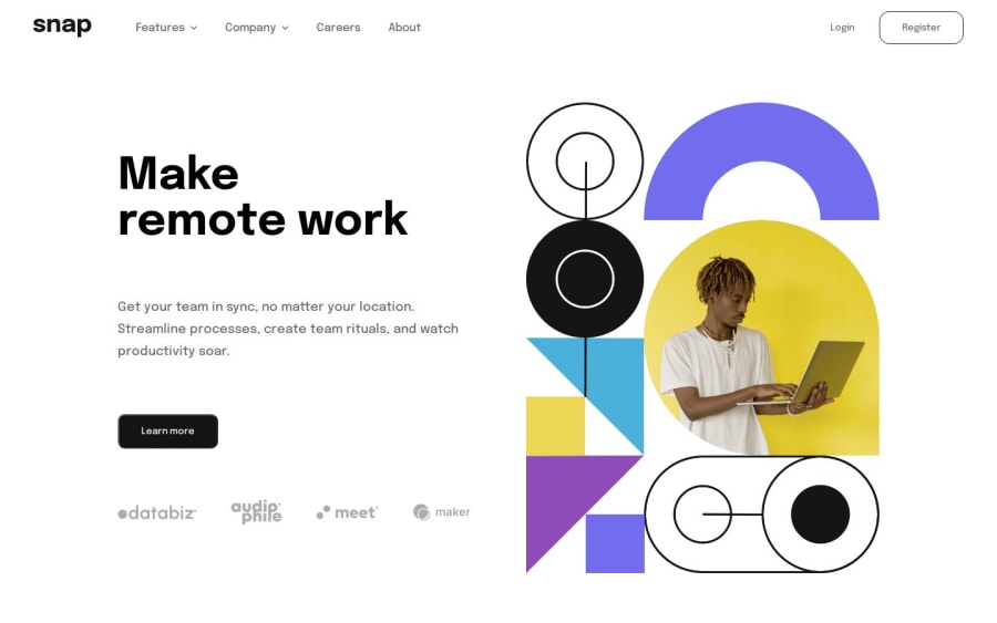
Design comparison
SolutionDesign
Solution retrospective
What are you most proud of, and what would you do differently next time?
Demorar menos na criação das resoluções
What challenges did you encounter, and how did you overcome them?Deixar o layout responsivo, principalmente na questão do mobile e as configurações dos botões que apesar da configuração no js não funcionam como deveriam para o desafio.
What specific areas of your project would you like help with?As configurações do botão do JS, tive muita dificuldade com eles e ainda não consegui faze-los funcionar corretamente.
Community feedback
- @GenildocsPosted 3 months ago
Hello, congratulations on completing the challenge. I hope these tips help you with the buttons.
- In the class "one," use
topfor alignment.
.one { /* bottom: -170px; */ right: 0; top: 30px; }- Remove the
display: noneproperty from the "menu-secundary" class. - Create a "close" class with the following values:
opacity: 0; visibility: hidden;- You need to apply the toggle to the div that contains the modal with the items. For example, in this "menu-secundario one" div.
Marked as helpful1 - In the class "one," use
Please log in to post a comment
Log in with GitHubJoin our Discord community
Join thousands of Frontend Mentor community members taking the challenges, sharing resources, helping each other, and chatting about all things front-end!
Join our Discord
