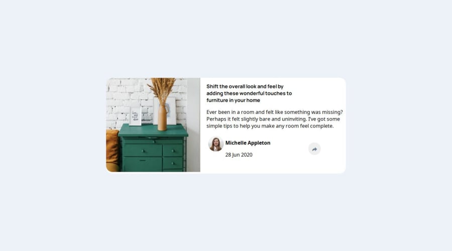
Design comparison
Solution retrospective
This was my first js project so it's kinda bad, hope you like it.
Community feedback
- @hussainFallahPosted 2 months ago
i think that you can more responsive by changing the body font size when the width of the page is changing for example
body{
font-size : clamp(.8em,calc(.8em + 0.7vw),1em);
}
feel free to change the values to your needs
and i think that your share panel isn't positioned properly , i think that you can solve this problem by giving the section a position relative so it's become positioned then change the position of the panel using "em"s for pc version use
section{
position:relative;
}
section>div:last-of-type{
    right: -3.2em;
    bottom: 8em;
}
and for mobile just change it accordingly keep in mind tat you have to set position value other than static on the section so it works
0
Please log in to post a comment
Log in with GitHubJoin our Discord community
Join thousands of Frontend Mentor community members taking the challenges, sharing resources, helping each other, and chatting about all things front-end!
Join our Discord
