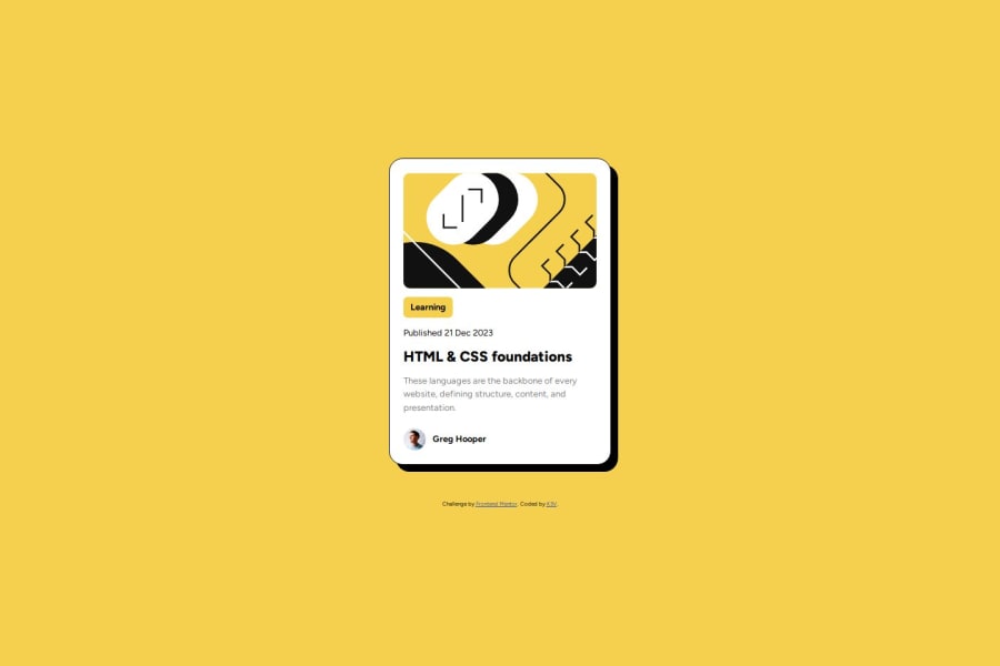
Design comparison
Solution retrospective
None
What challenges did you encounter, and how did you overcome them?None
What specific areas of your project would you like help with?None
Community feedback
- P@Islandstone89Posted about 1 year ago
Hi Kevin, here is some feedback - I hope it helps!
HTML:
-
Every webpage needs a
<main>that wraps all of the content, except for<header>andfooter>. This is vital for accessibility, as it helps screen readers identify a page's "main" section. Wrap the card in a<main>. -
Use classes instead of IDs. This article explains when to use the
ìdattribute. -
Change "Learning" to a
<p>. -
Wrap the date in a
<time>element:<p>Published <time datetime="2023-12-21">21 Dec 2023</time></p>. -
As this is a blog card, the heading needs a link inside.
-
Do not use words like "image" or "picture" in the alt text, as screen readers will announce it as an image by default. Change it to "Headshot of Gary Hooper".
-
Wrap "Greg Hooper" in a
<p>. -
.attributionshould be a<footer>, and you should use<p>for the text inside.
CSS:
-
Including a CSS Reset at the top is good practice.
-
Remove the width and height on
html, body. -
Add around
1remofpaddingon thebody, so the card doesn't touch the edges on small screens. -
On the
body, addmin-height: 100svhandgap: 2rem. -
Remove the width on the card.
-
Add a
max-widthof around20remon the card, to prevent it from getting too wide on larger screens. -
font-sizemust never be in px. This is a big accessibility issue, as it prevents the font size from scaling with the user's default setting in the browser. Use rem instead. -
Remove the height on the card_author div. You can set a height or width on the profile image if needed.
Marked as helpful0@KevinBlyweertPosted about 1 year ago@Islandstone89 Many thanks for this complete review! CSS is kinda my weakness, I will improve thanks to your remarks.
1@KevinBlyweertPosted about 1 year ago@Islandstone89 Once again, thank you, I followed your advices and improved my previous work. That's the way I should be working on. I'll focus more on semantic and accessibility in the future. Your enlightenment helped me.
1 -
- @sarachafikidrissiPosted about 1 year ago
the code looks complicated for me i have write a different code
0
Please log in to post a comment
Log in with GitHubJoin our Discord community
Join thousands of Frontend Mentor community members taking the challenges, sharing resources, helping each other, and chatting about all things front-end!
Join our Discord
