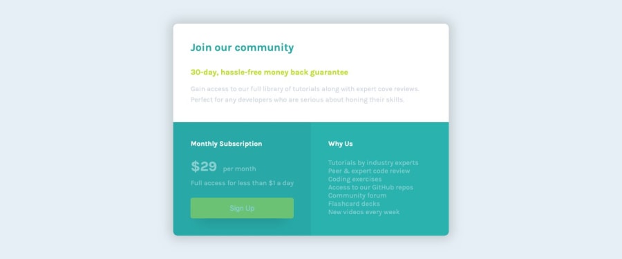
Design comparison
Community feedback
- @mattstuddertPosted about 5 years ago
Awesome work Lucas!! 👍
I really like the addition of the content transitions as well. One small recommendation would be to use a
divfor the smaller internal areas, like.page-intro. I'd say the overall component is thesectionand then the other areas are just smaller groupings of content. That's a really minor point though.Keep up the great work!
0@mattstuddertPosted about 5 years ago@LucasGomestl you're welcome. Yeah, it can be slightly confusing.
divelements are typically used for smaller groupings of content, whereassectionis used for a larger, often related grouping of content e.g. an intro or a testimonial section. Thearticleelement is used to wrap around self-contained content that provides value independently from the rest of the content on the site e.g. a news article or blog post.I hope that helps!
0@LucasGomestlPosted about 5 years ago@mattstuddert It helps me a lot, Matt, especially because of the examples.
Thanks for the support! 👍
0@LucasGomestlPosted about 5 years ago@mattstuddert Hello Matt.
I've been praticing and reading about HTML5 semantic elements, it still makes me confused sometimes, specially when I need to decide between using
section,articleordiv.So, thanks for the feedback, it will be really useful!
0
Please log in to post a comment
Log in with GitHubJoin our Discord community
Join thousands of Frontend Mentor community members taking the challenges, sharing resources, helping each other, and chatting about all things front-end!
Join our Discord
