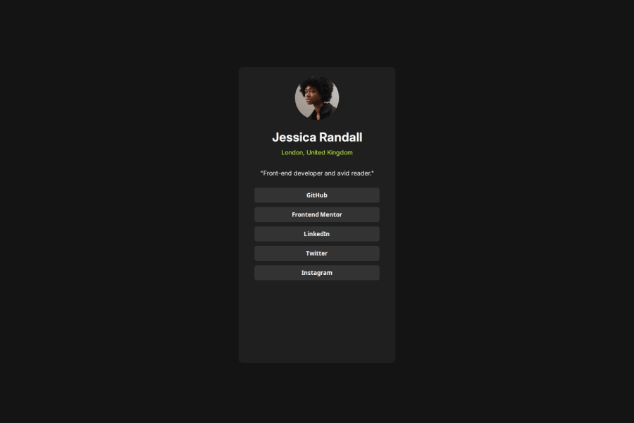
done responsiveness using CSS grid and media query.
Design comparison
Community feedback
- @glowri57Posted 2 months ago
Hi Ajinkya Hajere, This is good work but here are a few things I noticed:
-
You should consider that there are mobile devices with more than 375px. You can use the inspect option and click the desktop icon beside Elements to see a lot of devices and their widths. This would help you consider other devices while trying to make your website responsive. Check out this article also from a Frontend mentor dev responsive-meaning, she goes into more detail.
-
You should avoid using px as it is an absolute unit and not a responsive unit like rem or em, You should look at this article from a Frontend mentor dev, Why font-size must NEVER be in pixels
-Another great resource to check out is px to rem converter.
I hope you found some of this information helpful, You should give the articles a good read. Happy coding! 💻
0 -
Please log in to post a comment
Log in with GitHubJoin our Discord community
Join thousands of Frontend Mentor community members taking the challenges, sharing resources, helping each other, and chatting about all things front-end!
Join our Discord
